Building Ontop's design system
A shared foundation that helps teams deliver consistent experiences across platforms.
Product Design
UX Design
Design System
Overview
A visual and component language that unifies Ontop products
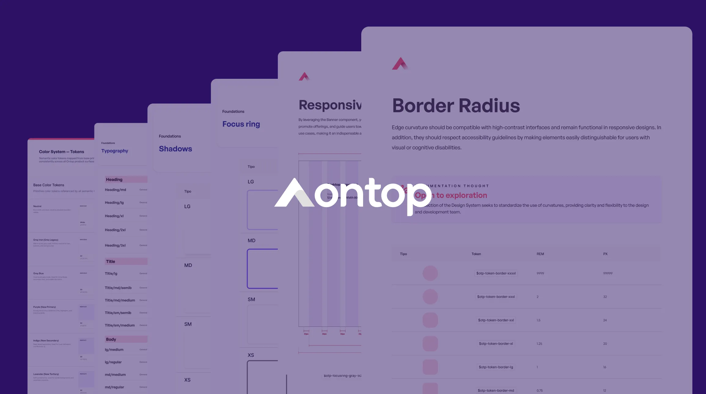
Ontop was growing into an ecosystem of products for distinct segments. That growth exposed a problem: each platform was evolving with different visual and interaction criteria, affecting consistency, scalability, and delivery speed. The goal was to build a design system that aligned products, teams, and technologies around one shared language.
The Challenge
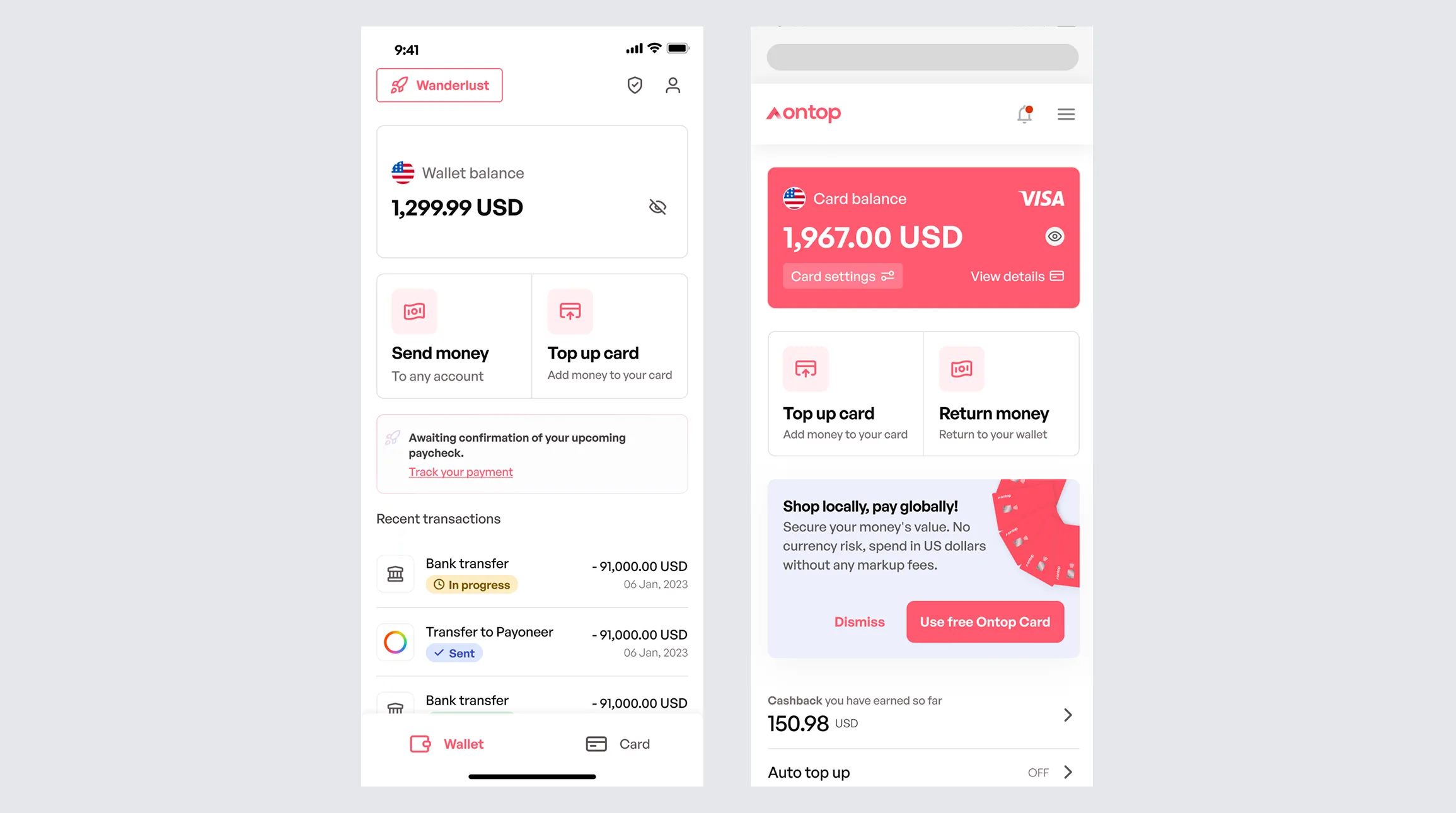
The core challenge was creating a design system that could serve products for different segments within one ecosystem, while preserving cross-platform cohesion and raising the visual and functional standard.
Inconsistency across 3 platforms and technologies
Each Ontop product used different visual criteria and interaction patterns, creating a fragmented user experience and duplicating design and development effort.
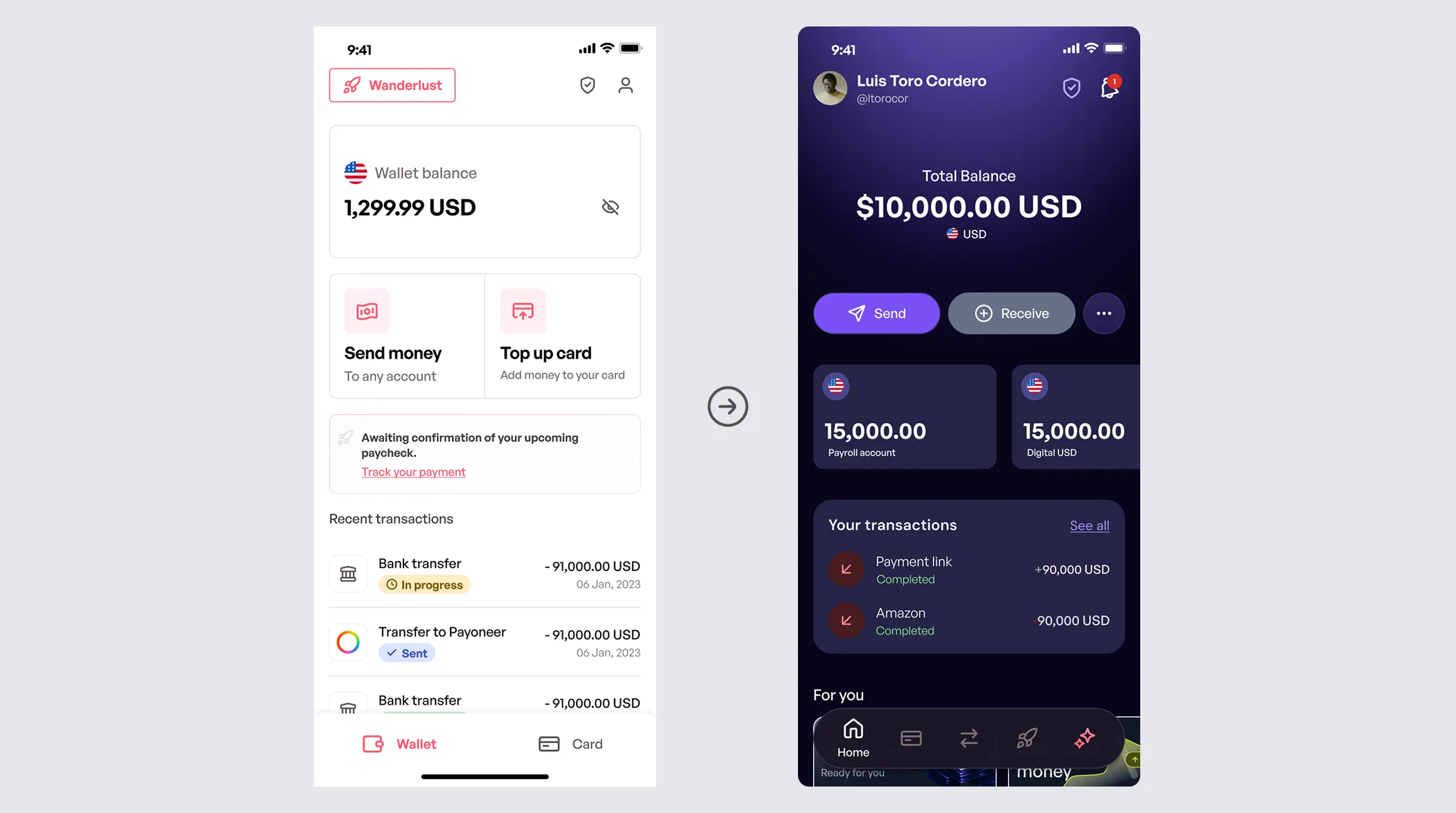
Low readiness for dark mode migration
The lack of semantic tokens and a normalized color palette made a consistent dark mode migration unfeasible, despite growing user demand.
System restructuring while Marketing redefined the brand
The design system had to evolve as Marketing redefined Ontop's visual identity, requiring a cross-functional update to every component and token.
Process
To create an adoption path grounded in reality, the work began with diagnosis and mapping:
Audit (diagnosis)
Created an inventory of existing components to identify inconsistencies in UI, tokens, behavior, and accessibility, then prioritized standardization by product impact and use.
Foundations (tokens + rules)
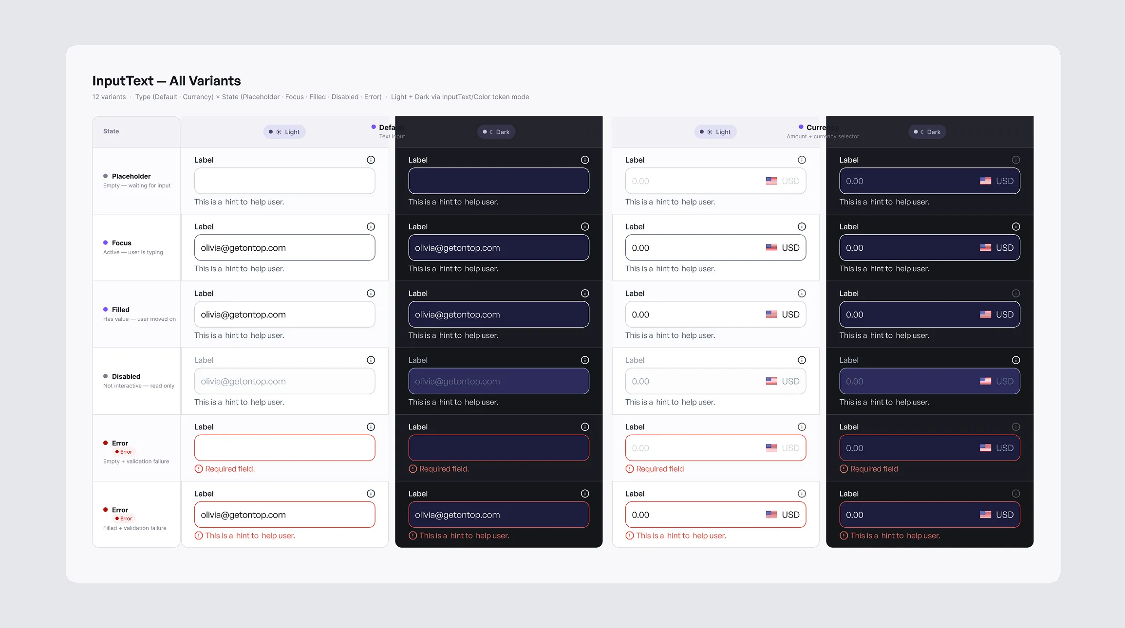
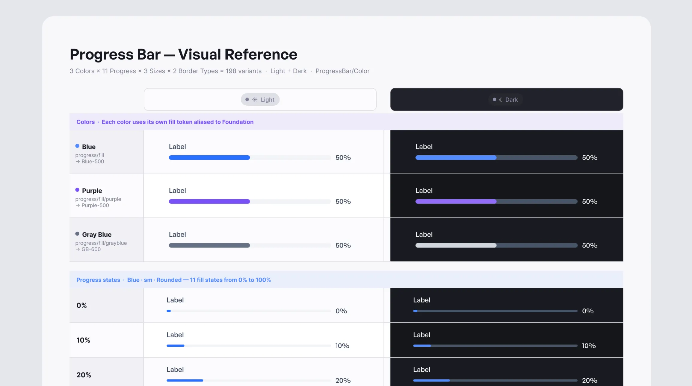
Defined the design system's foundations, including typography, a semantic color palette, spacing and grid scales, elevation, shadows, radii, and borders.
Componentization (UI kit)
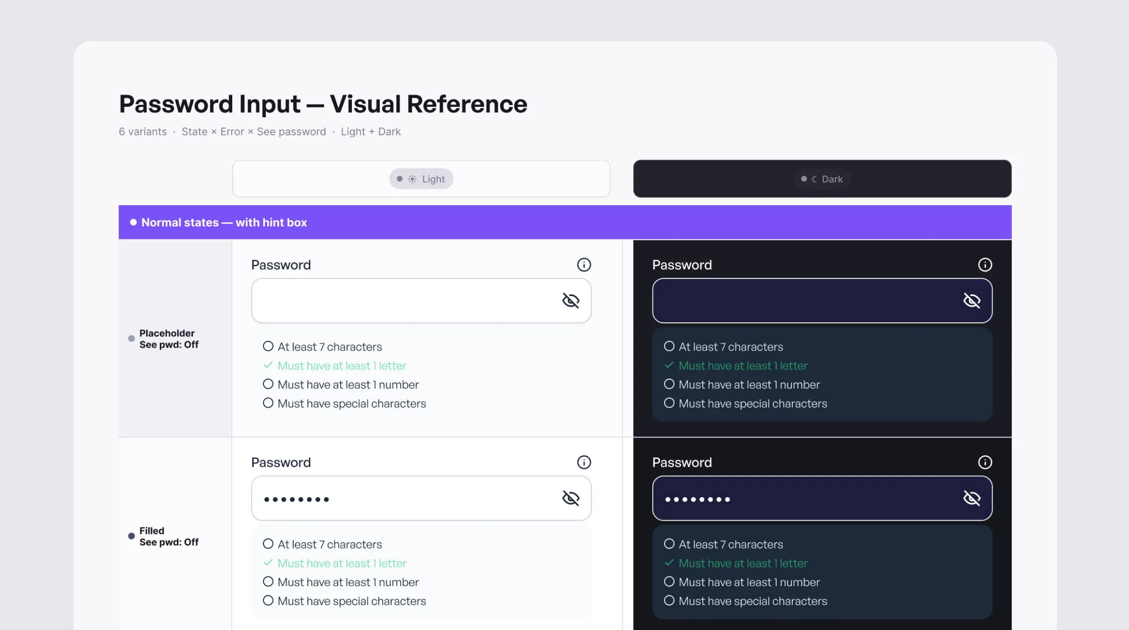
Built the system's core components and patterns, defining their variants, states, and usage guidelines to ensure consistent implementation.
QA and testing (the differentiator)
Conducted internal validation and testing in real environments to ensure component consistency and performance, then iterated from the feedback received.
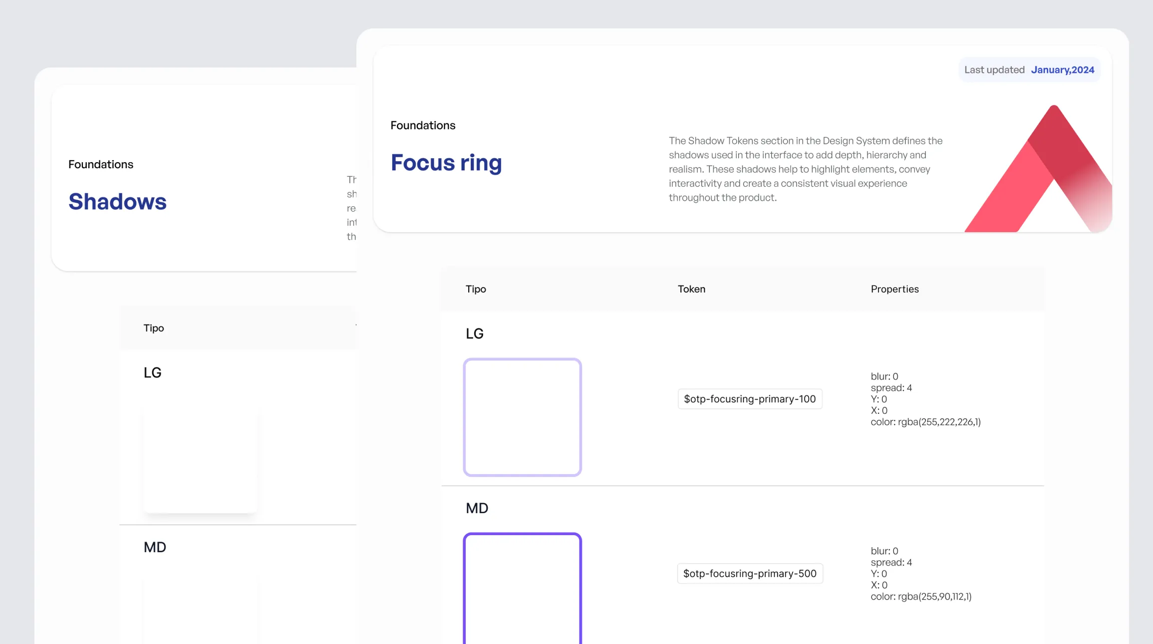
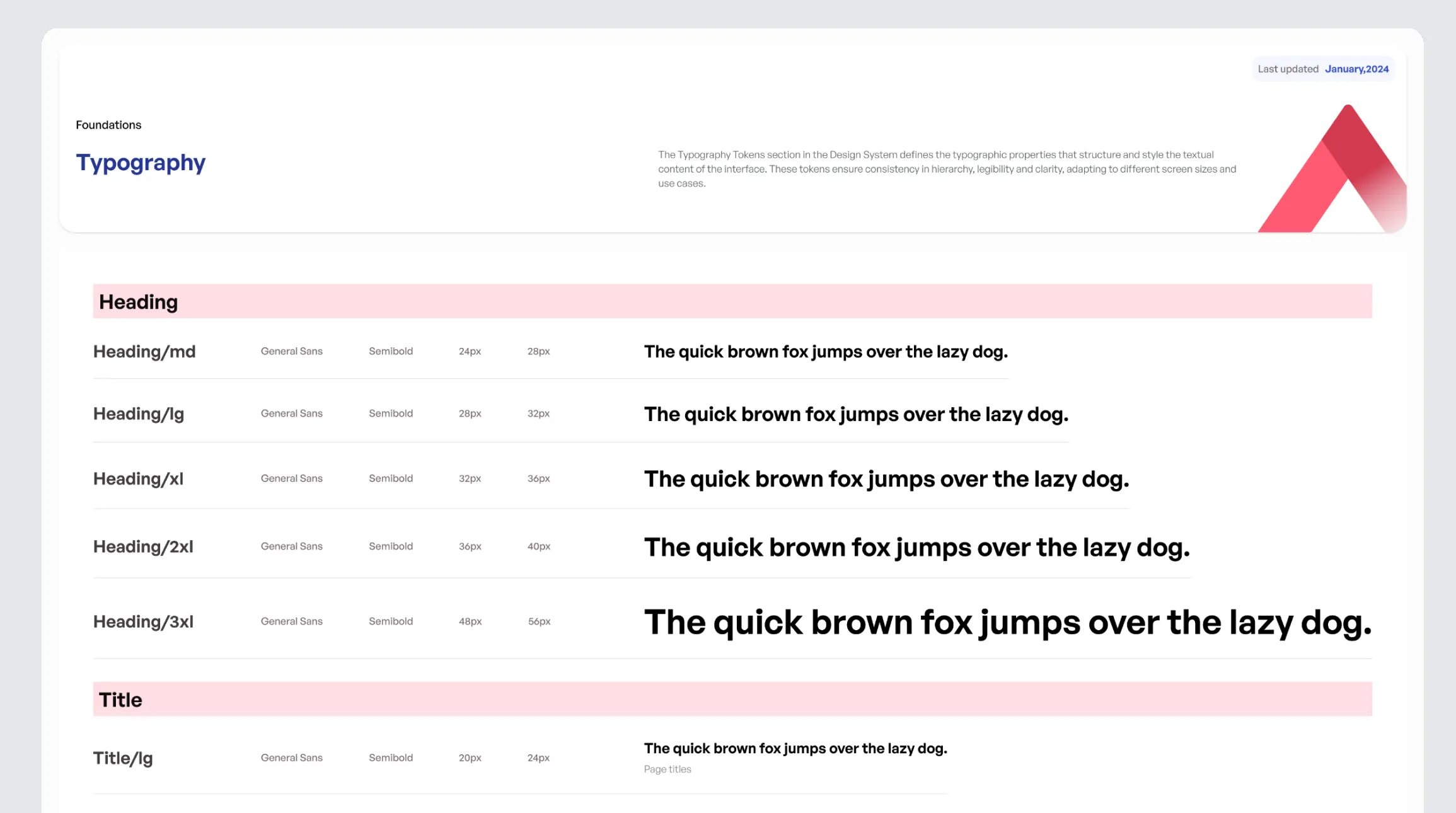
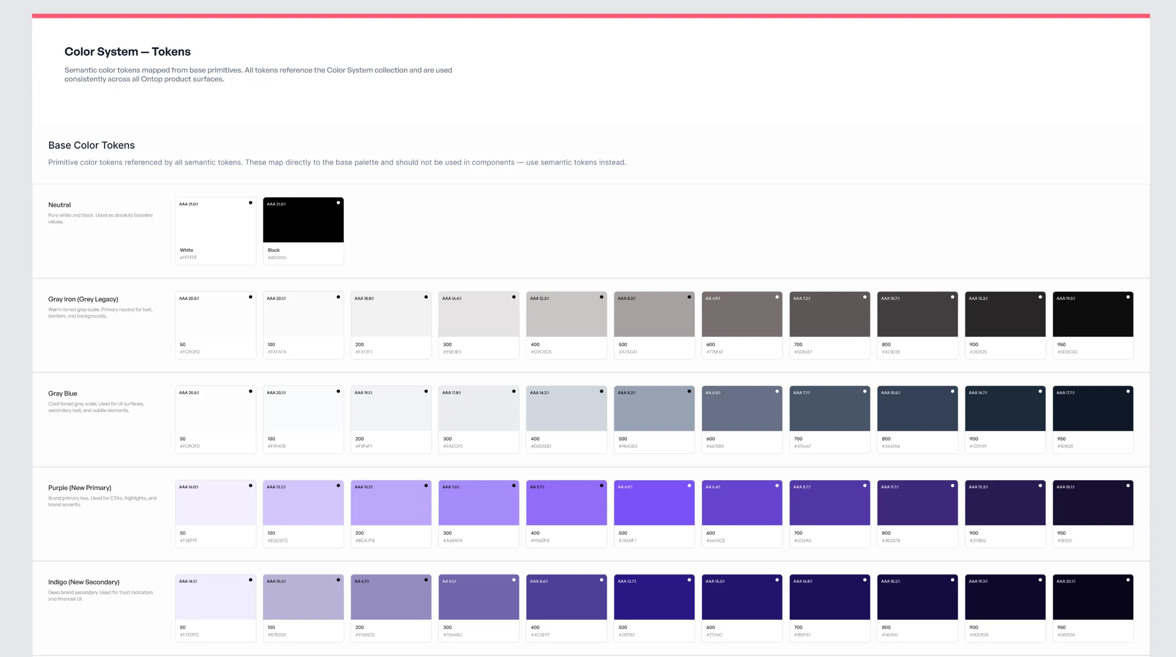
Solution
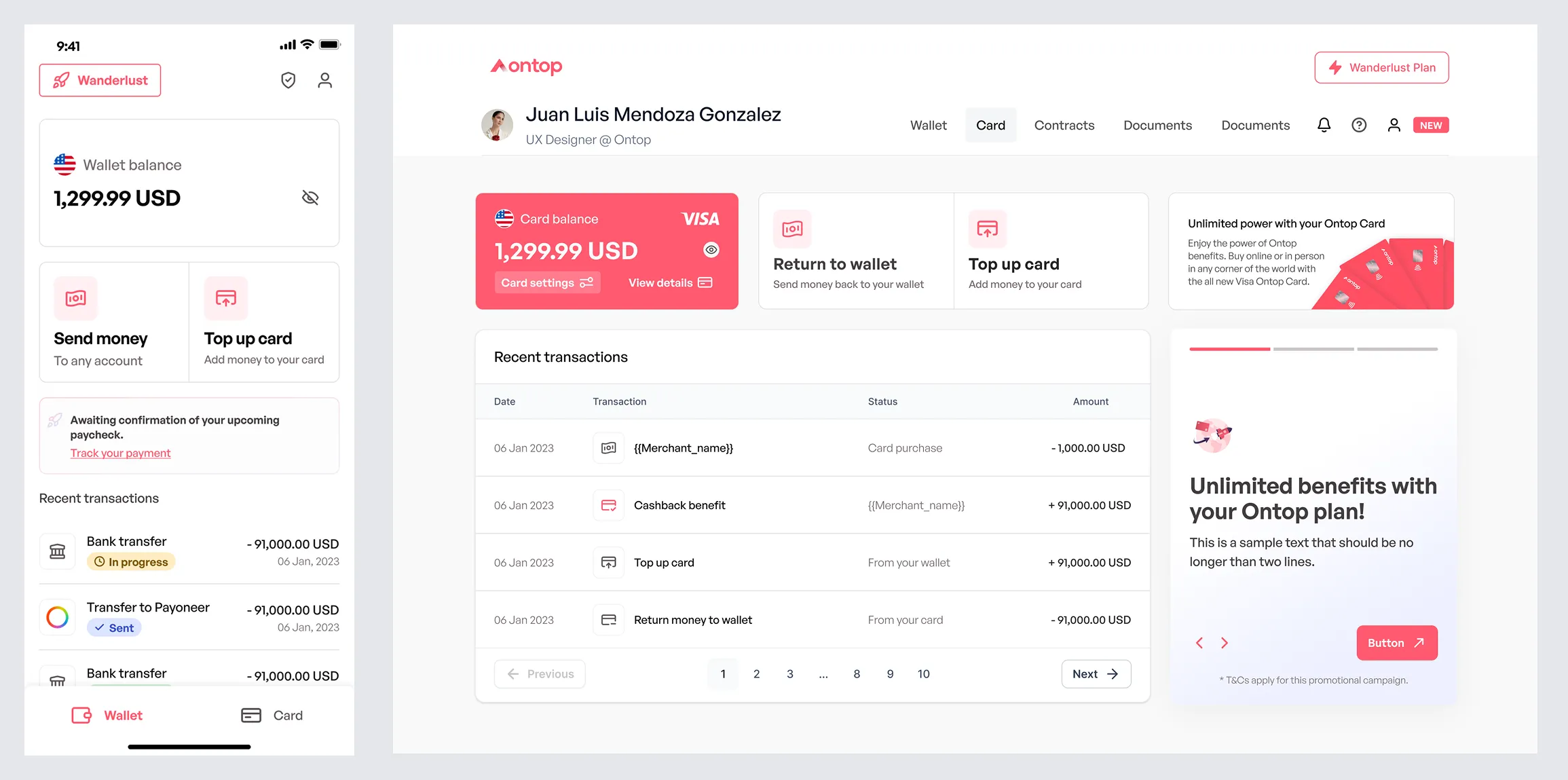
The result was a functional design system, ready for incremental implementation and grounded in the product's reality:
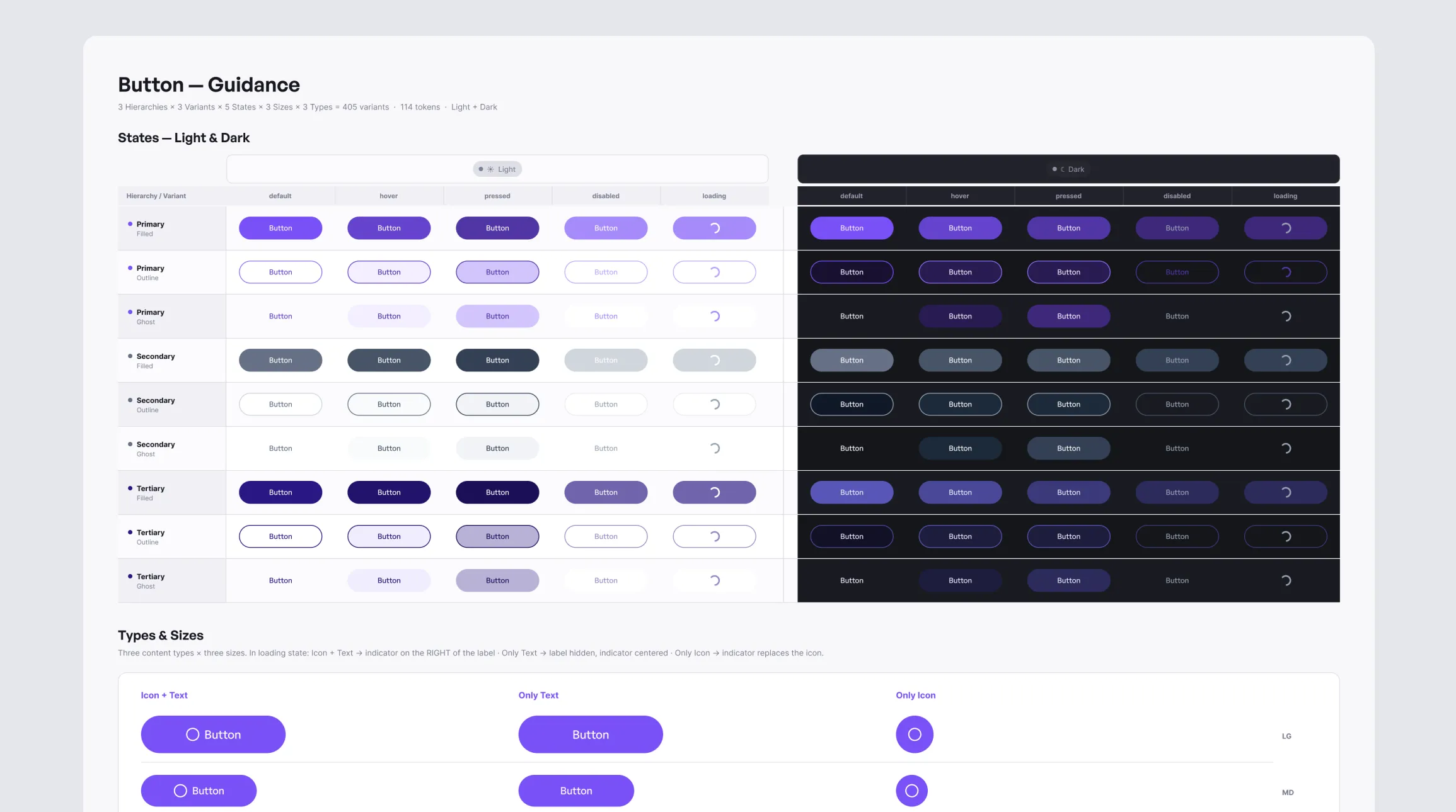
Impact
Design speed (time to design)
Previously, a screen took 10–12 hours because of iteration and inconsistency. With components and tokens, this dropped to 6–8 hours, a 30–40% improvement.
Less rework from UI inconsistencies
Adjustments for UI inconsistencies dropped from 18–25% to 8–12% of tickets, reducing rework by 40–60%.
Product consistency
Standardized key components, reducing redundant visual variants by 35–50%.
Development efficiency (design-engineering alignment)
Clear guidelines reduced sprint-time clarifications by 20–30%.
Team adoption of the system
Use evolved from partial adoption to 70–85% adoption across new screens through the design system.
Indirect experience impact (perceived quality)
Greater consistency improved perceived quality, with +5 to +10 points in UX/UI metrics or fewer QA issues.
This design system became the foundation for building and scaling the Ontop ecosystem with consistency, speed, and readiness for the future (dark mode and new fintech standards).