Simplifying loan applications
A guided application flow designed to reduce friction and build applicant confidence.

Product Design
UX Design
Prototyping
Overview
Credit without uncertainty
Scotiabank Colpatria was expanding product applications through its Oneclick channel (web + app via WebView). The challenge was to scale the experience to personal and revolving credit while maintaining consistency with other products (accounts/cards) and reducing friction. As Product Designer, I led the end-to-end redesign: diagnosis, research, definition, interaction and UI design, user validation, and developer handoff.
Problem
The application experience was shaped by two critical issues:
Distrust and uncertainty
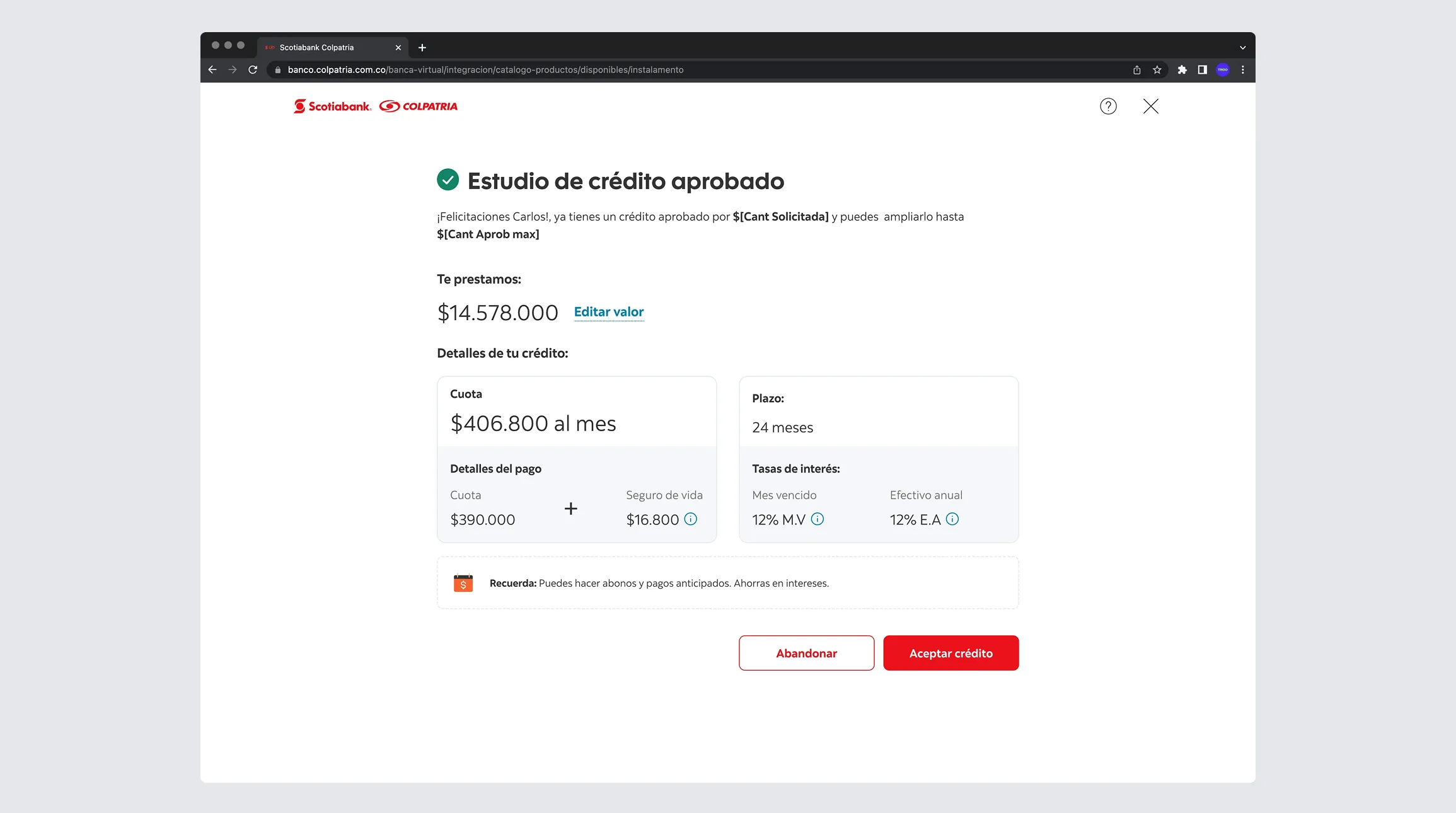
People did not know what they needed, what the bank was offering, or why certain information was required. Rate and terms communication felt incomplete or "not transparent enough," increasing anxiety and abandonment.
No simulation tool
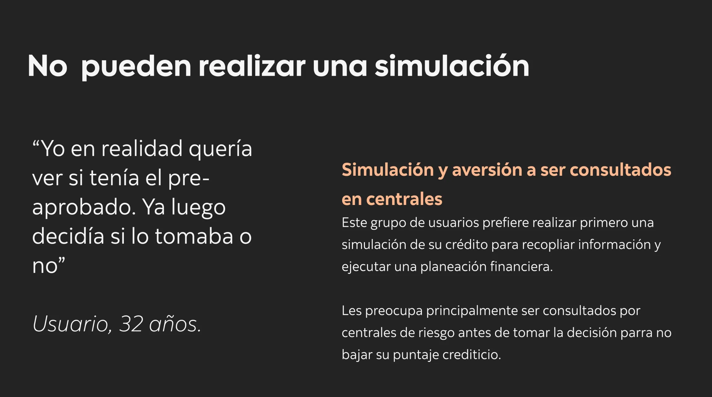
Without a payment and scenario simulation, people could not test whether the loan fit their budget. This heightened the perceived risk ("I'll move forward, then they'll show me something worse") and weakened completion intent.
Result: high abandonment, low conversion, and an inconsistent product experience.
Research
To understand why people abandoned the flow and what needed to change, I used a mixed-method approach:
Oneclick funnel and channel metrics analysis
I identified the screens with the highest drop-off, especially where financial or legal information appeared and where people were asked for information they perceived as "excessive."
Interviews + moderated testing (banked users seeking credit)
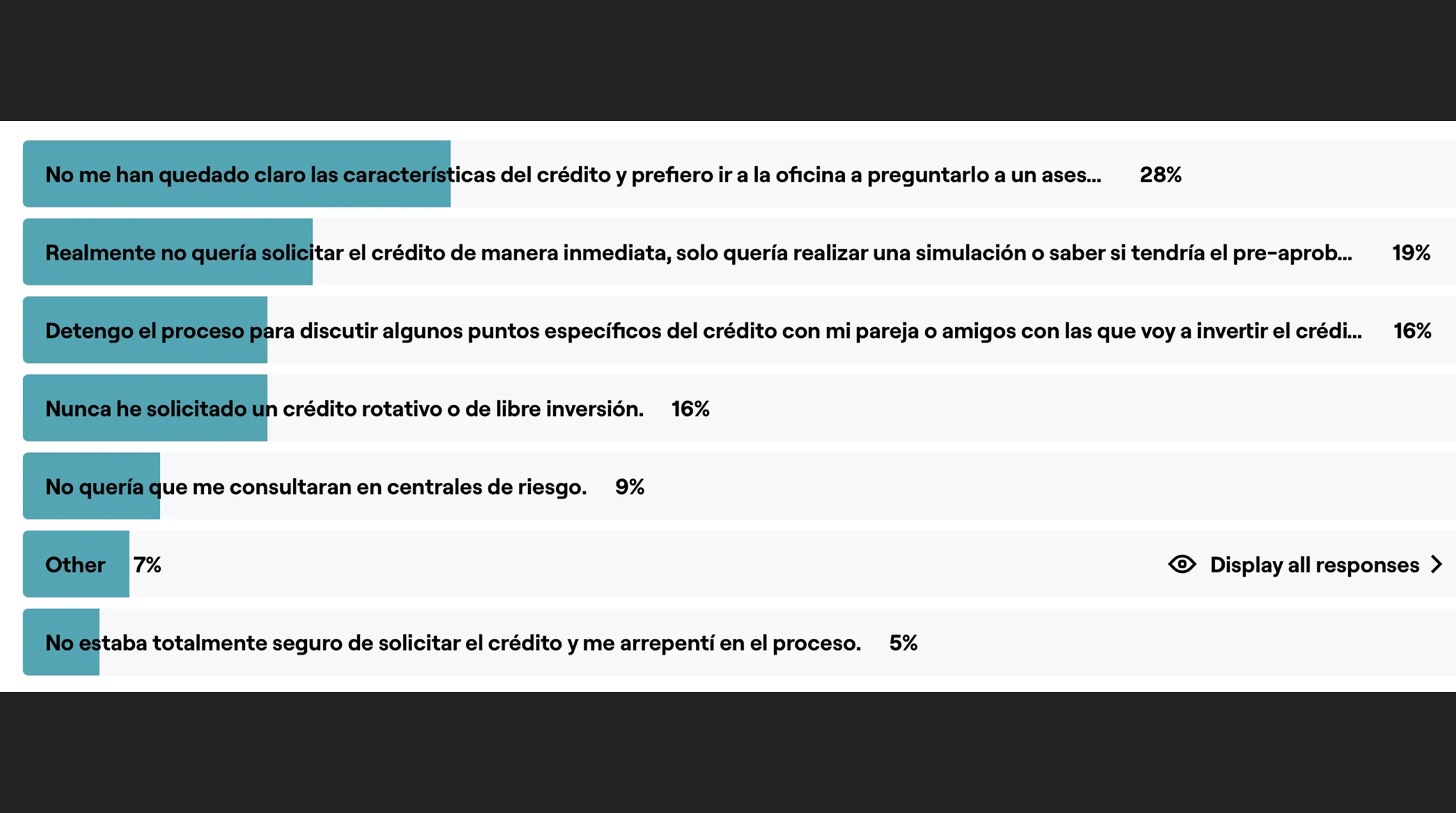
We found clear patterns: "I don't understand whether I qualify" / "I don't know how much I'll pay" / "They don't show clear rates" (fear of a surprise rate) / "Too many fields for something that should be quick."
Heuristic review
We documented inconsistent patterns, ambiguous microcopy, weak visual hierarchy, and components misaligned with the design system.
Competitive benchmark
We reviewed trust-building patterns: simulators, payment breakdowns, rate ranges, scenario comparisons, clear progress indicators, and security and privacy messaging.
Design Decisions (what I did differently)
Based on the findings, I made design decisions focused on transparency, control, and lower cognitive load:
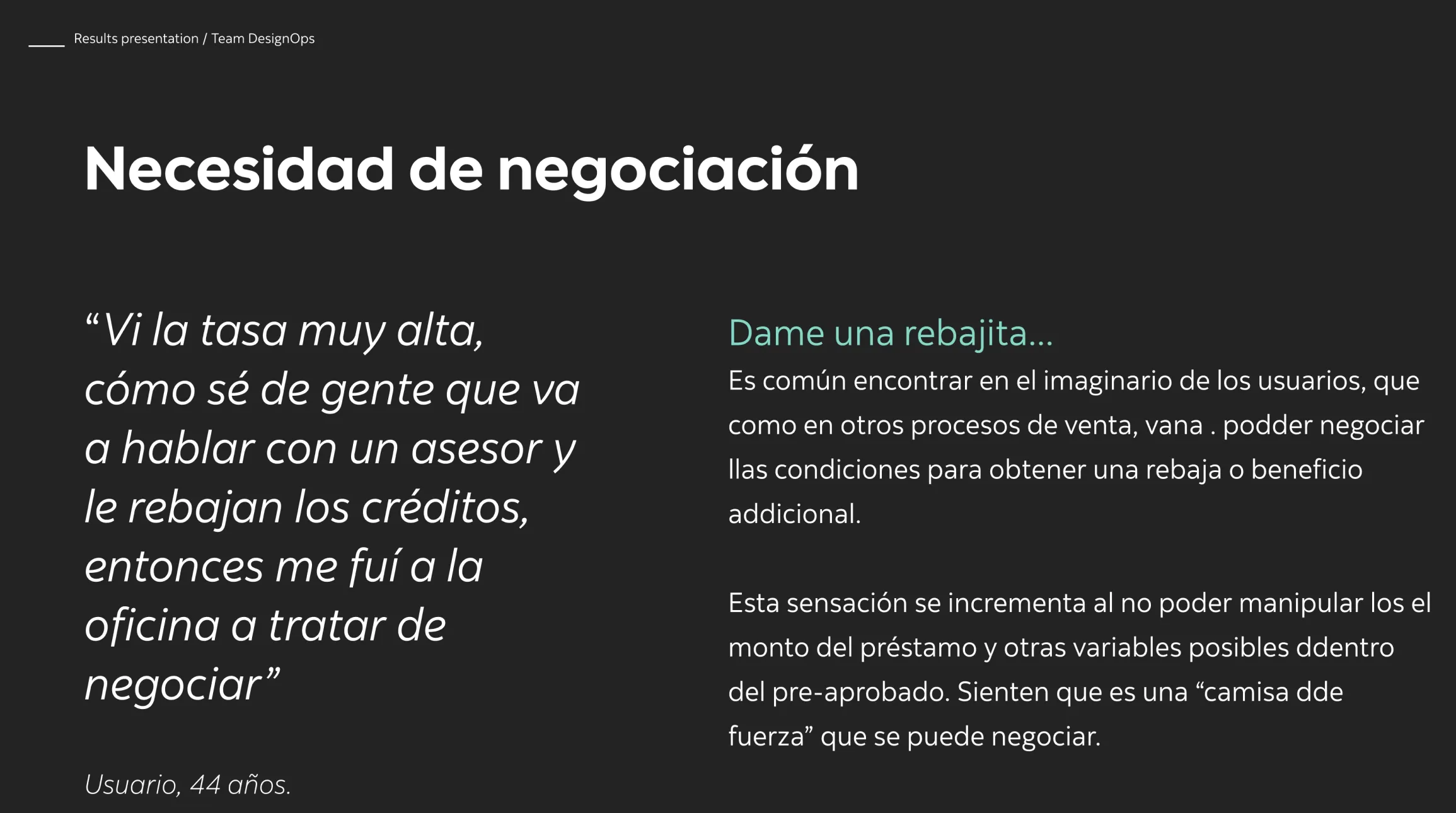
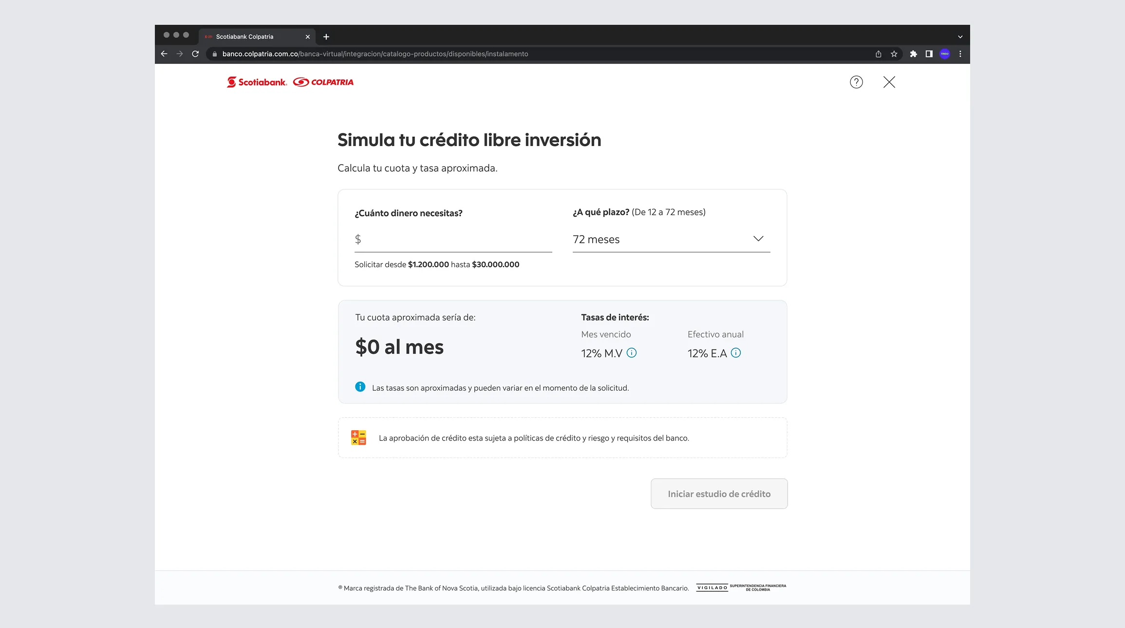
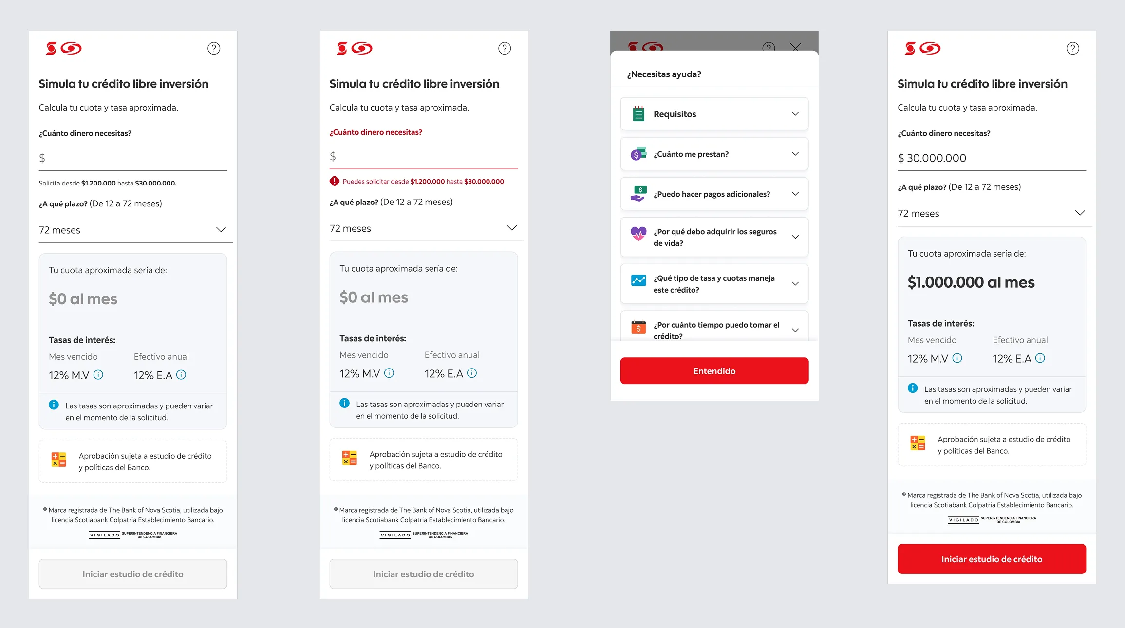
- Early simulation: show payments and scenarios upfront to build confidence.
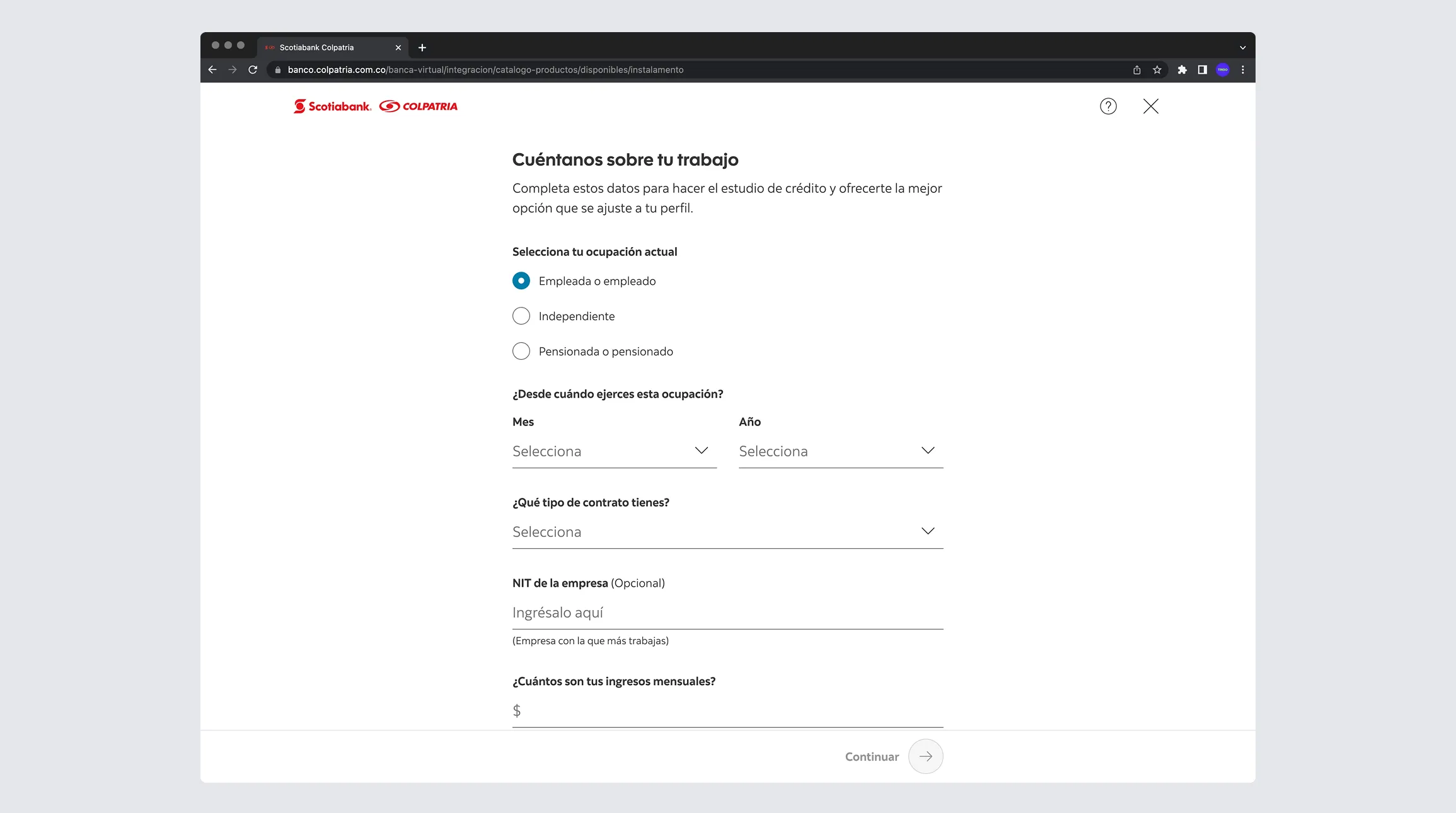
- Simplified fields: reduce and explain inputs with clear microcopy.
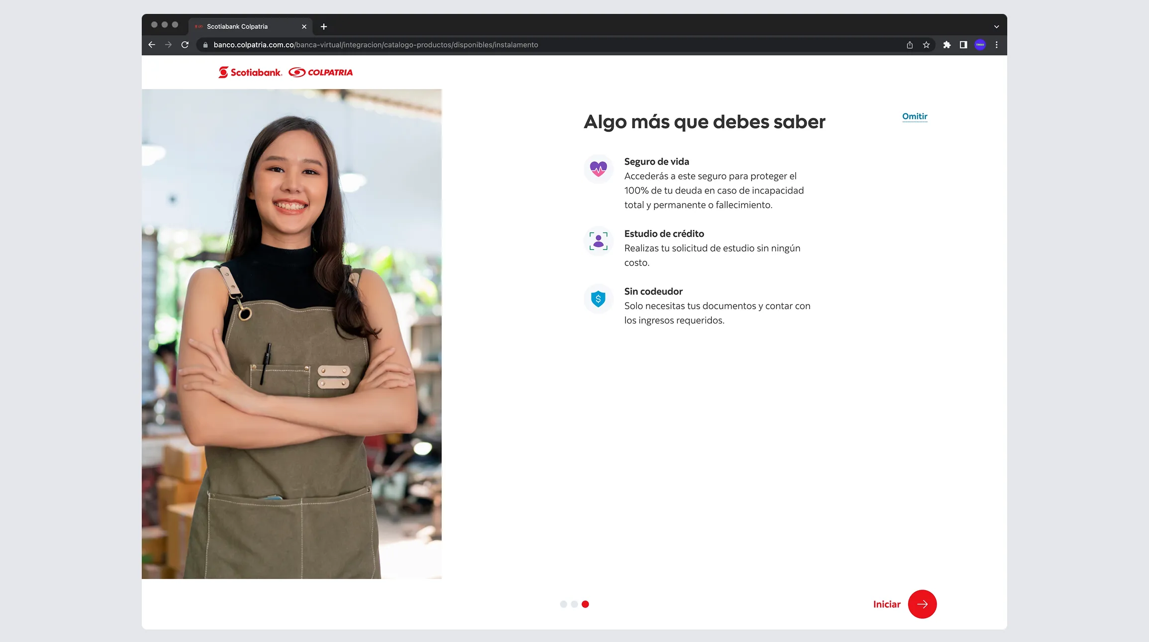
- Standardized UX: consistent components and rules across products.
- Legal storytelling: concise, clear legal copy in human language.
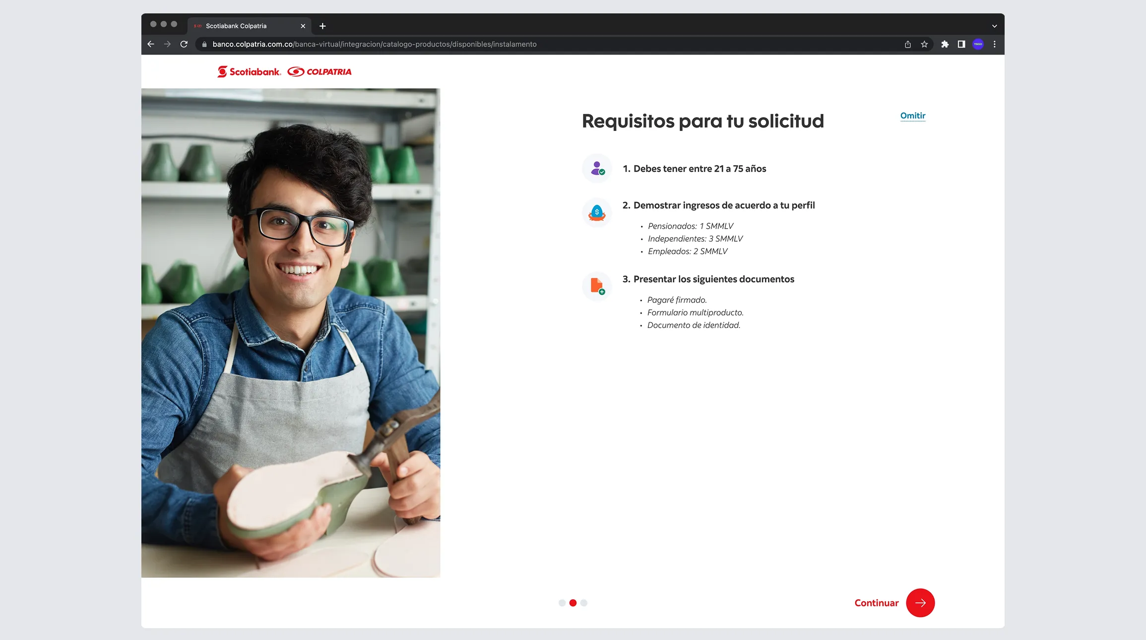
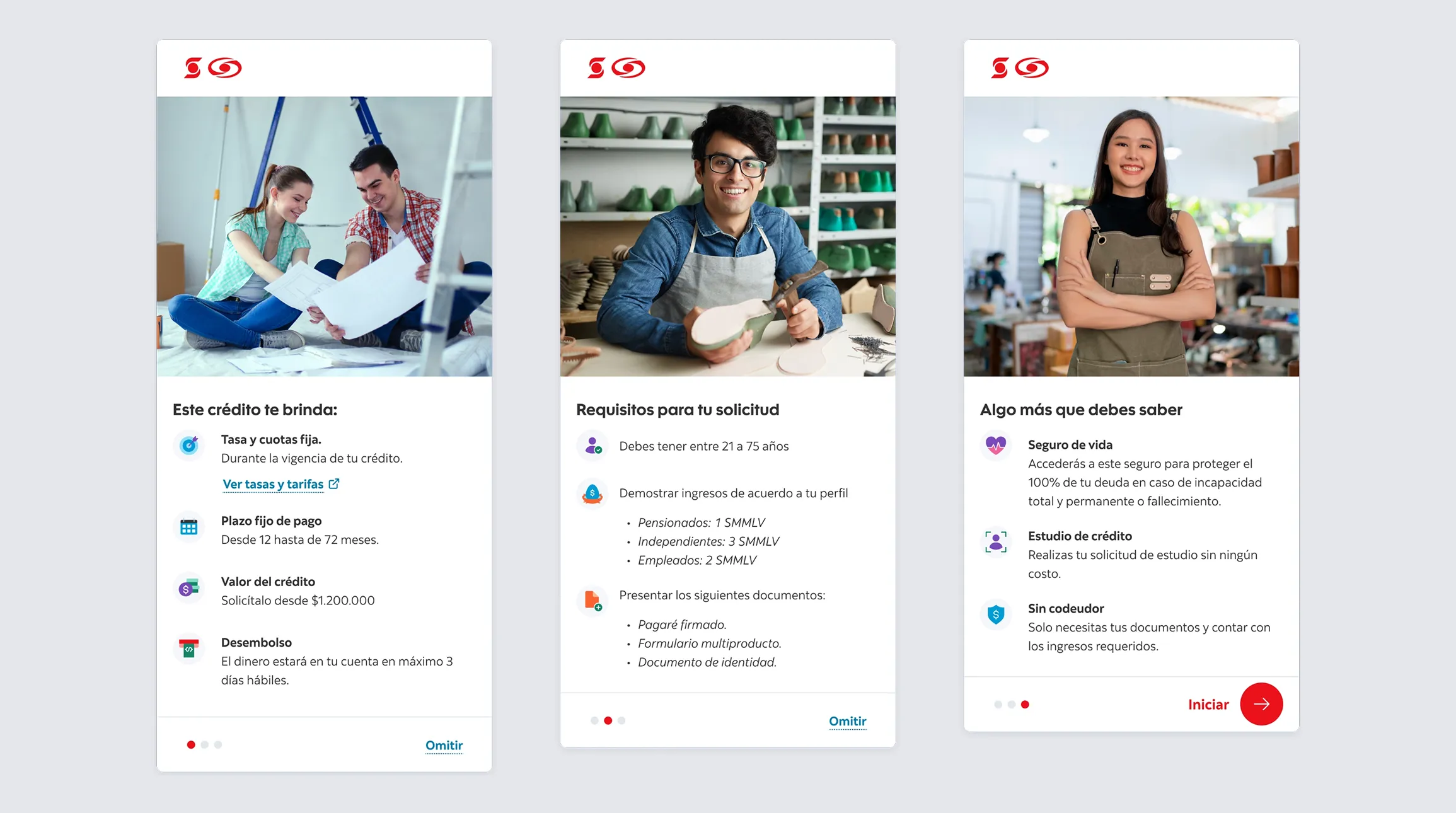
- Process clarity: explain eligibility, timelines, and next steps.
Solution
The final redesign delivered a more trustworthy, consistent, decision-oriented application experience:
Integrated simulator (Personal / Revolving credit)
Optimized form
Transparency
Consistent UI/UX
Impact
Less abandonment at the critical step
Early simulation and greater transparency reduced drop-off around rates and terms by 18% to 25%.
Higher conversion
Lower friction and greater perceived control drove a 10% to 18% increase in total flow conversion.
Greater perceived trust
Clearer offers improved trust metrics by +20 to +30 points in clarity scores or up to +1.2 on perception scales.
Simulator use drives intent
Between 60% and 75% of users interacted with the simulator, and those who used it were up to 1.6x more likely to complete.
Faster completion
Simplifying the flow reduced total completion time by 12% to 20%.
Fewer errors and retries
Clear validation and contextual help reduced field-level errors by 15% to 30%.
This project strengthened Scotiabank Colpatria's service ecosystem by standardizing the Oneclick experience and improving user confidence and self-sufficiency through simulation and clear communication. It created a reusable foundation for scaling product applications with higher conversion and less friction.