Scaling Scotiabank's design system
A local design system that brought consistency to complex financial journeys.
Product Design
UX Design
Design System
Overview
From global to local: the Scotiabank Design System in Colombia
Scotiabank entered Colombia through the acquisition of a local bank, Colpatria. The team inherited an existing technology stack, including frameworks, libraries, patterns, and front-end constraints, while needing to preserve the visual identity and familiar experience of the acquired bank's customers.
At the same time, Canada had a global Design System, with tokens, components, and guidelines, intended to standardize the experience across the group. As Product Designer and Design System Staff, I led the adaptation, improvement, and progressive adoption of the global system for Colombia.
Problem
The challenge was not to implement a Design System from scratch. It was to migrate without breaking the business:
Technology gap
The local stack could not immediately support every component and pattern in the global Design System.
Maturity gap
The local UX team needed to keep shipping product while the system was built and adapted.
Identity risk
Adopting the global Design System as-is could dilute the acquired bank's brand and familiar patterns.
Operational cost
Without an adopted system, decisions were repeated, components duplicated, and UI/UX inconsistencies multiplied.
Research
To design a realistic adoption path, I began with diagnosis and mapping:
Audit of existing UI and components in Colombia
An inventory of live web and app components, including variants, states, and visual debt.
Gap analysis against Canada's global Design System
Identified what could be reused, what needed adaptation for branding, language, or regulation, and what was technically unfeasible.
Development review: feasibility and roadmap
Validated local front-end constraints and defined a progressive, compatible, incremental strategy.
Internal adoption research across design and delivery
Quick team interviews and rituals surfaced friction around Figma libraries, handoff, documentation, and recurring questions.
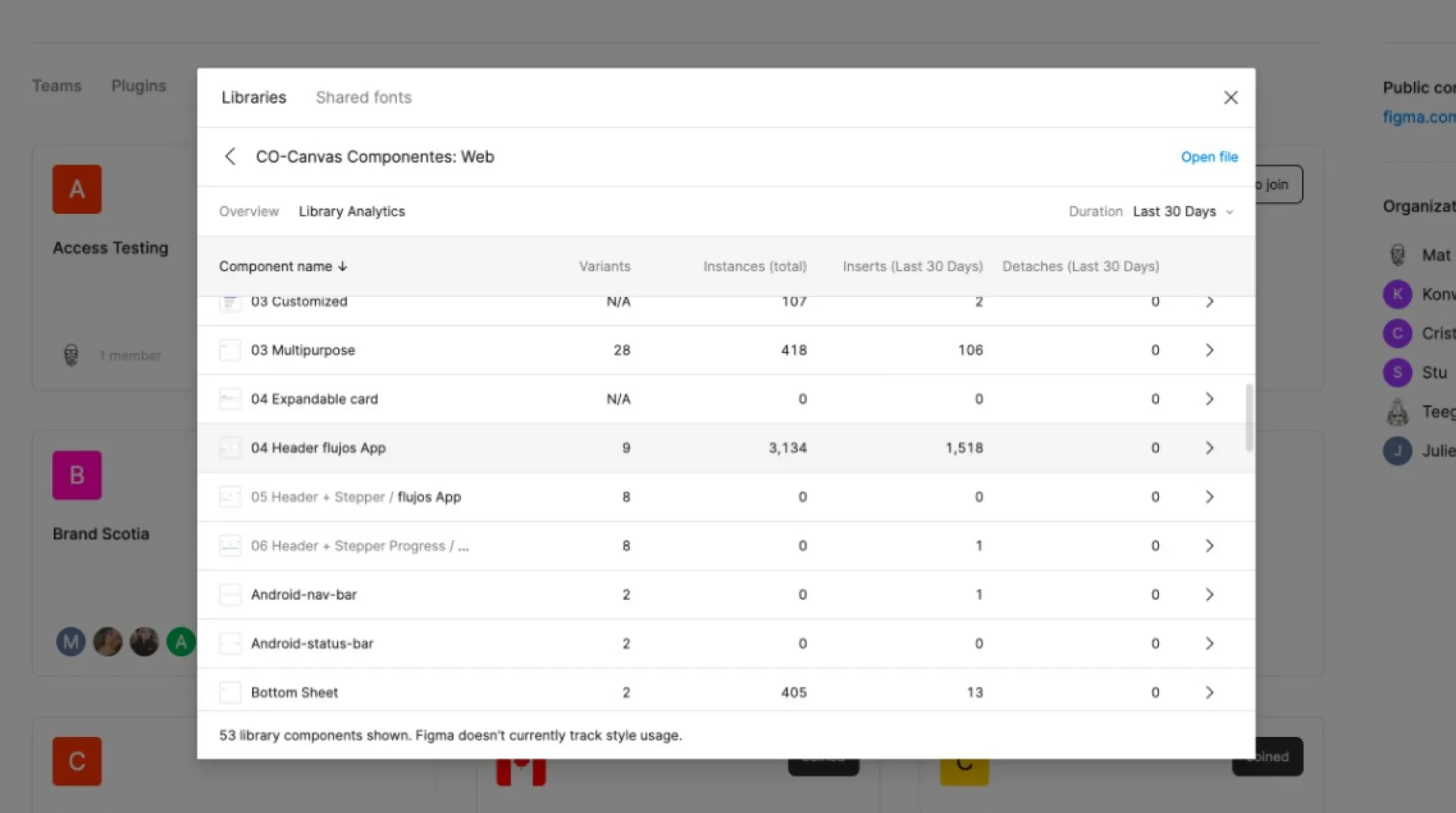
Most-used components in our Colombia library
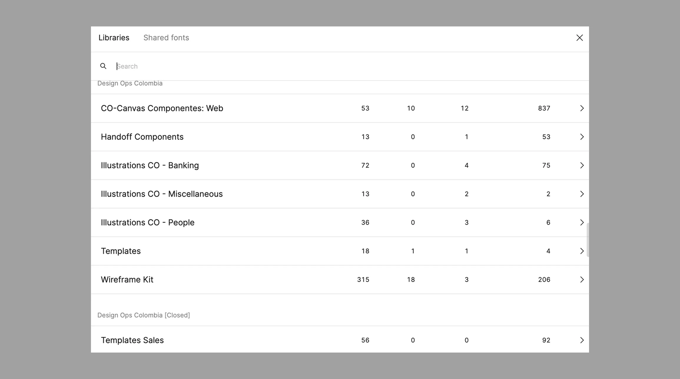
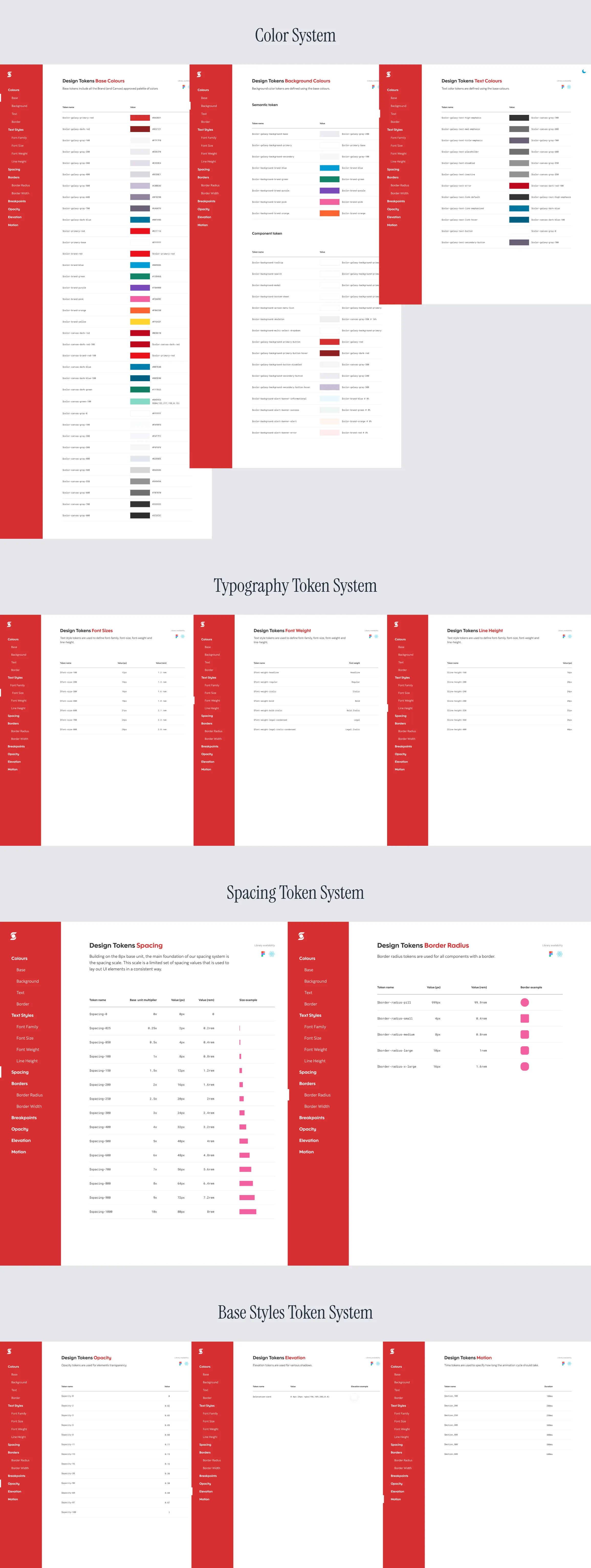
Figma libraries created for Colombia
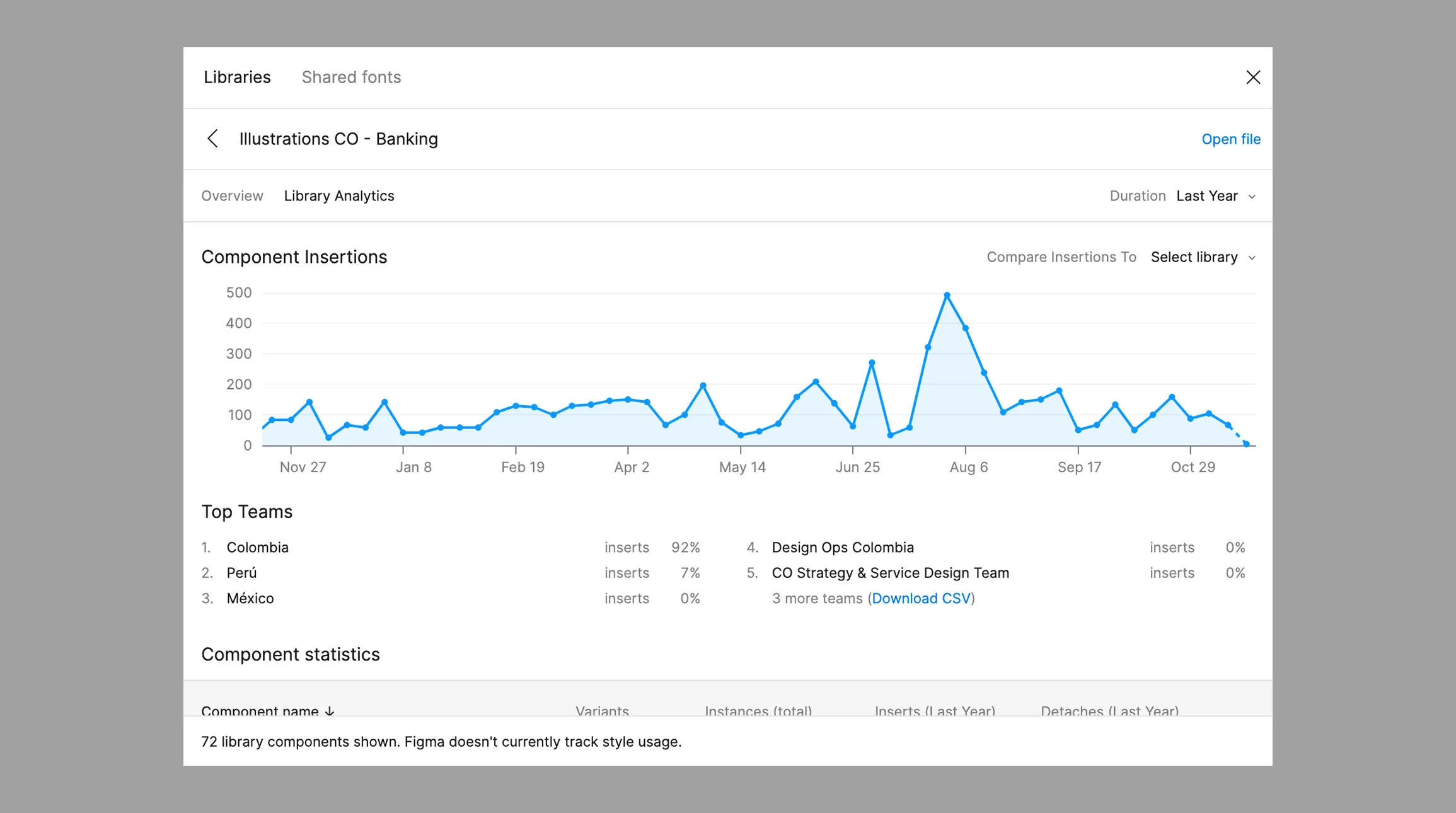
Components contributed to our libraries
Design Decisions (what I did differently)
The diagnosis informed key decisions that made the system adoptable, not merely polished:
- Layered adoption strategy (Tokens → Components → Patterns): Rather than migrate everything at once, work moved through abstraction levels that let teams progress without breaking what existed.
- A compatibility model for local identity: Instead of forcing 100% of the global Design System, I defined where to retain the local brand and where standardization would create consistency.
- Prioritize by consistency ROI: Focus effort on components with the greatest experience impact and expected reuse.
- Documentation as a product, not an appendix: Usage guidance, decision principles, examples, and do/don't rules enabled anyone to use the system without relying on me.
- A continuous cycle: review → refine → standardize → launch → measure: The system stayed alive through iterations grounded in team feedback and usage metrics.
Solution
The outcome was a functional adaptation of the global Design System for Colombia: incrementally implementable and aligned with the product's reality.
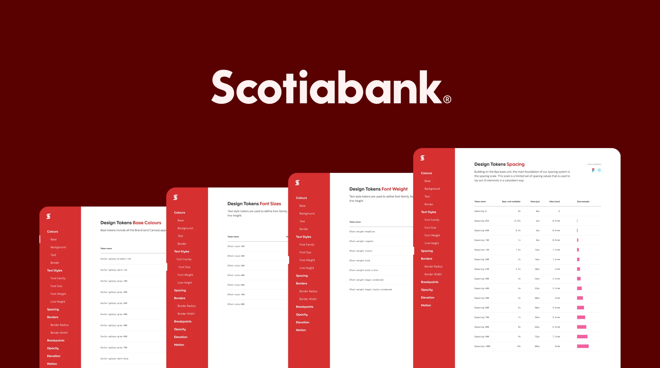
Tokens were tailored to local market needs and the acquired bank's identity, including colors, typography, spacing, and base styles.
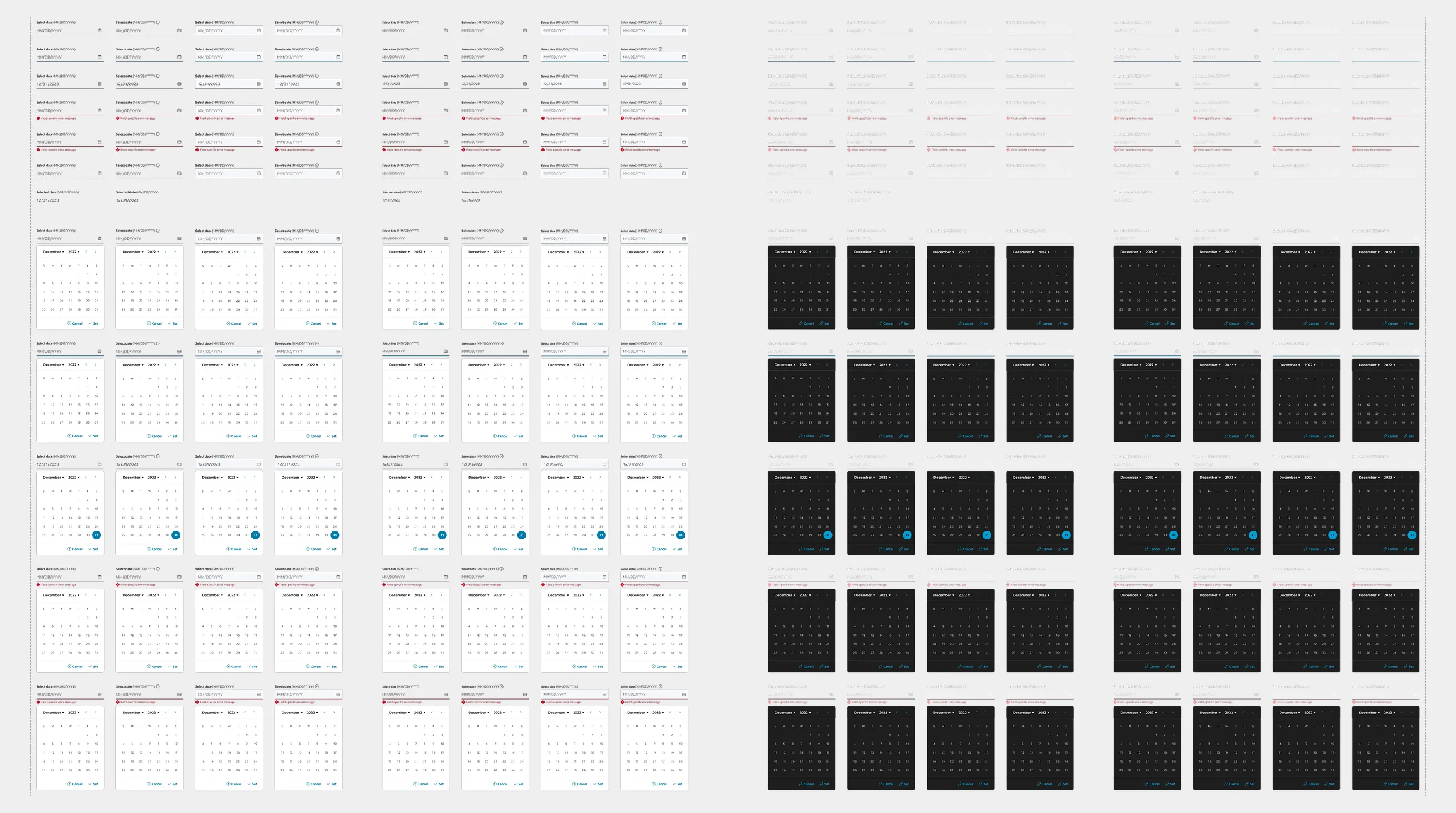
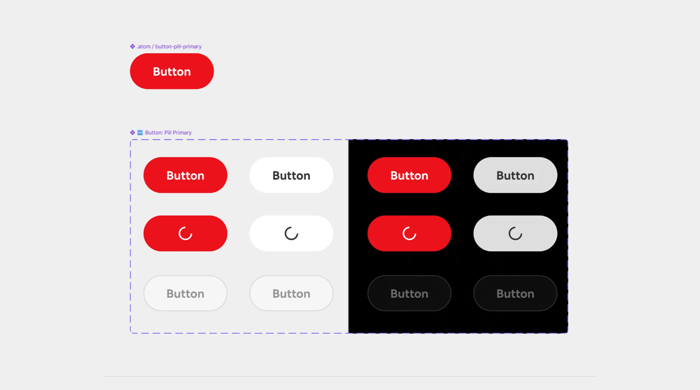
Component audit and consolidation: grouped repeated variants into reusable components and templates, reducing duplication.
Most-used components in our Colombia library
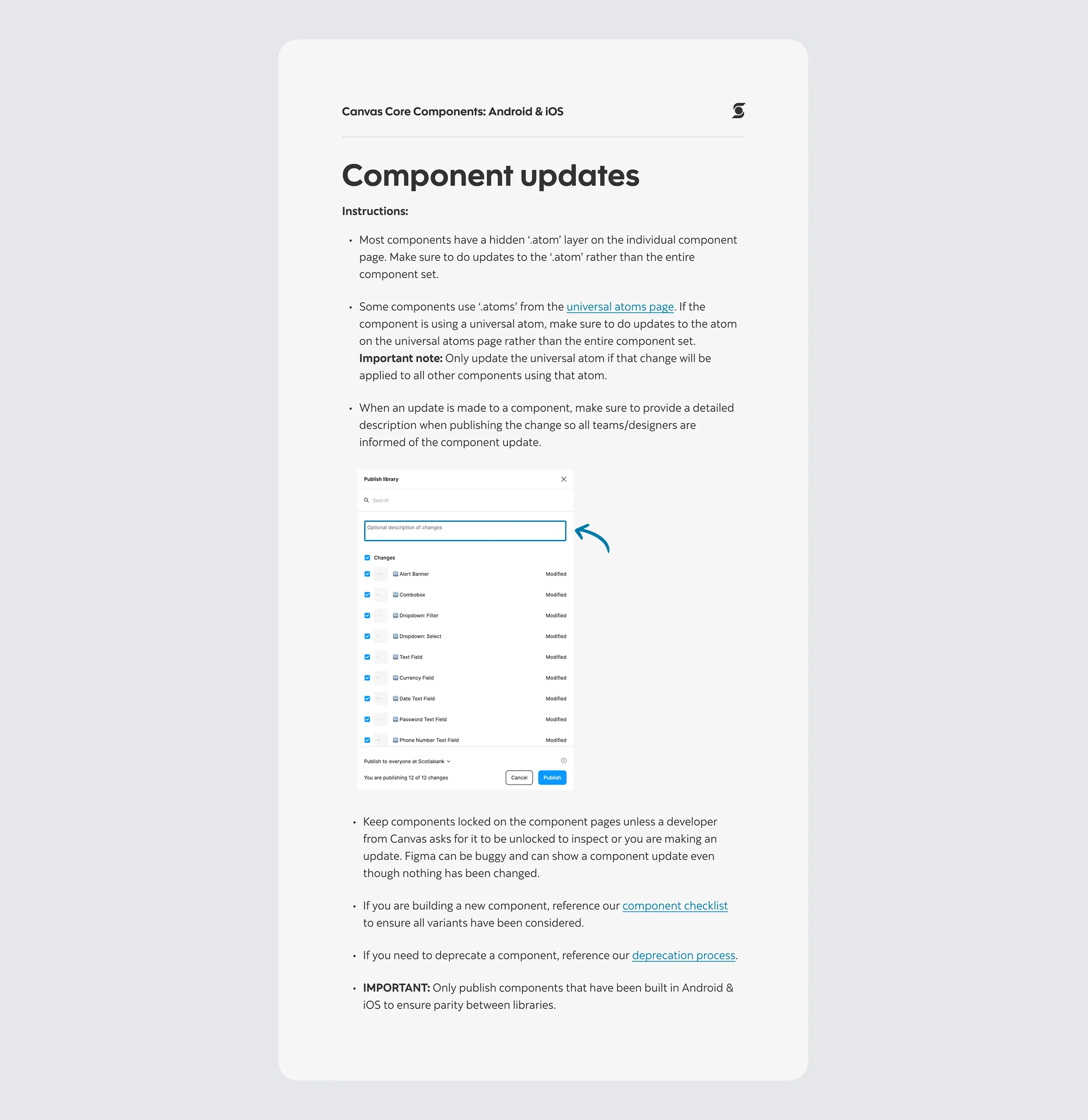
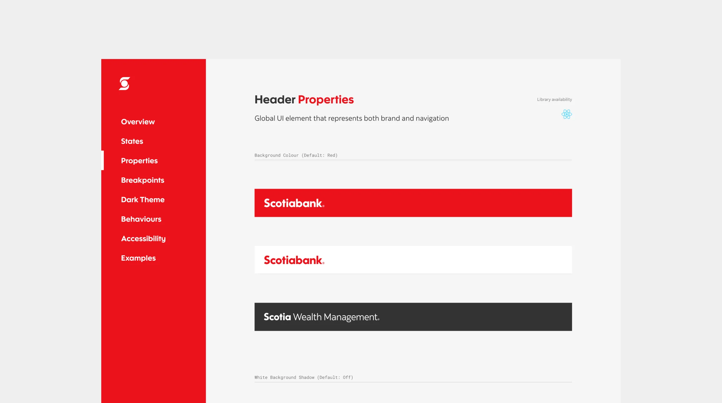
An updated, accessible repository for the UX team: a Figma library, clear documentation, and shared conventions.
Figma libraries created for Colombia
Collaboration with development to translate guidelines into implementation: defining viable components for the current stack, migration roadmaps, and acceptance criteria.
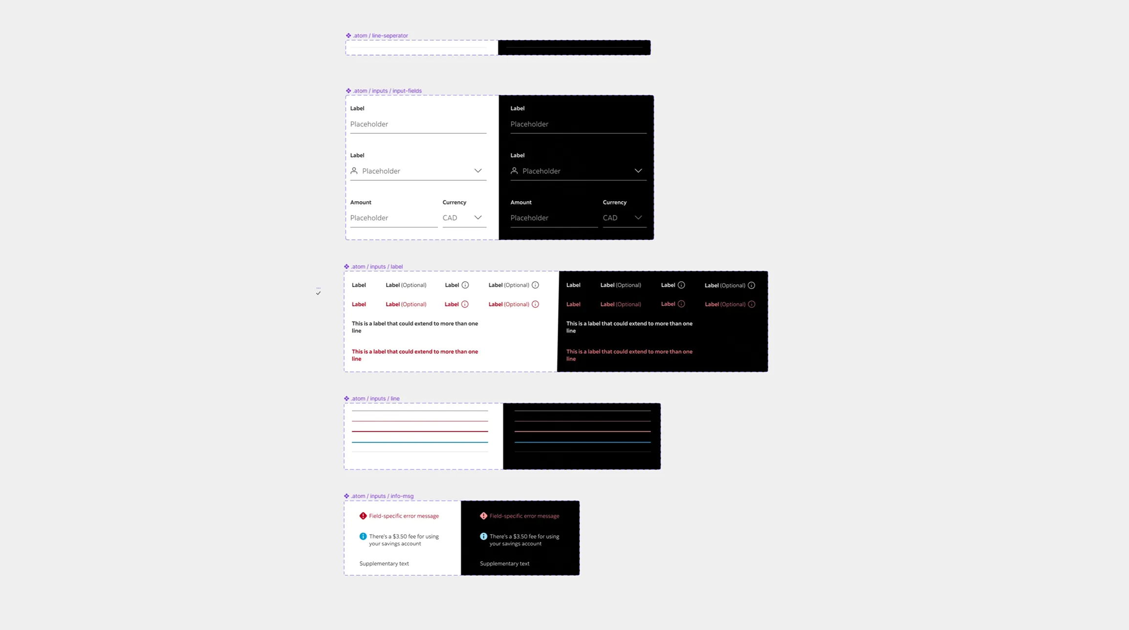
Internal adoption: rituals, team support, quick guides, and standardized processes helped the Design System support real projects without slowing delivery.
Impact
Design speed (time-to-design)
Before, a screen took 10–12 hours because of iterations and inconsistencies. With components and tokens, that fell to 6–8 hours, a 30–40% improvement.
Less rework from UI inconsistencies
UI-inconsistency adjustments dropped from 18–25% to 8–12% of tickets, reducing rework by 40–60%.
Product consistency
Key components were standardized, reducing redundant visual variants by 35–50%.
Development efficiency: design-dev alignment
Clear guidelines reduced sprint-time clarification requests by 20–30%.
Team adoption of the system
Usage moved from partial adoption to 70–85% adoption in new screens built with the Design System.
Indirect experience impact: perceived quality
Greater consistency improved perceived quality, with +5 to +10 points in UX/UI metrics or fewer QA issues.
I turned Scotiabank's global Design System into a viable standard for Colombia's existing technology, accelerating delivery, reducing design-development rework, and enabling a progressive transition that preserved the acquired bank's identity while scaling product consistency.