Redesigning Ontop Wallet
A clearer wallet experience that gives workers confidence in every financial decision.
Product Design
UX Design
Gamification
Overview
A simpler, more reliable, faster experience
Ontop is a wallet within the GetOntop ecosystem that lets thousands of people receive international payments, hold USD balances, and move money through transfers, a card, and withdrawals.
At the time, the app served 17,000+ users, but its experience lagged behind market expectations. Outdated visual patterns, inconsistent flows, and pervasive friction were directly affecting the business.
The Problem
The app showed three connected symptoms:
- Low perceived quality and trust
Trust is part of the product in a wallet. An outdated experience and dead ends created uncertainty, especially during critical moments such as withdrawing, transferring, or confirming a transaction.
- Friction in key tasks (activation and transactions)
The home screen and navigation surfaced too many options at once. People struggled to understand what to do and where to start, hurting conversion in P2P and other money-movement journeys.
- Clear impact on public and operational metrics
Store-rating pressure was mounting, while support metrics repeated the same pain points: confusion, errors, lengthy processes, and abandonment midway through a flow.
Research
To design precisely and quickly, research focused on evidence of real-world friction:
Qualitative and quantitative review of support tickets
Analyzed recurring patterns to identify the most common pain points and their impact on the experience.
Identifying dead ends and points of no return
Mapped journey moments where users dropped off without completing their task.
Reading market signals
Evaluated fintech trends to align the experience with current standards.
The biggest issue was not that users could not complete a flow. It was that they did not have enough confidence to do it.
Key Findings
The home screen functioned more like a large menu than a starting point: many features, little guidance. Forms asked for more than necessary and mixed operational information with user decisions. Progress and confirmation cues were missing, increasing anxiety ("Did it go through?" / "What is its status?").
Design Decisions
I made and advocated for decisions that enabled meaningful change without disrupting the product:
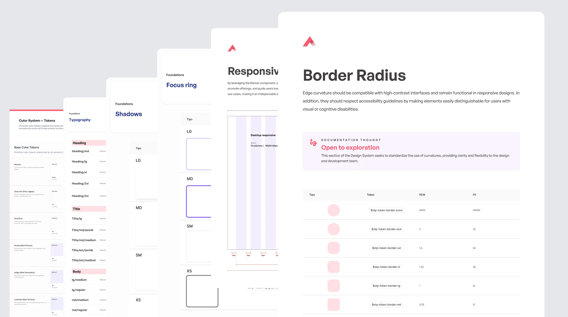
Design system foundations before the redesign
Built the component and token foundation first so the redesign could rely on a robust system from day one.
Incremental redesign of critical areas
Rather than a big-bang release, prioritized the highest-impact screens to deliver value quickly.
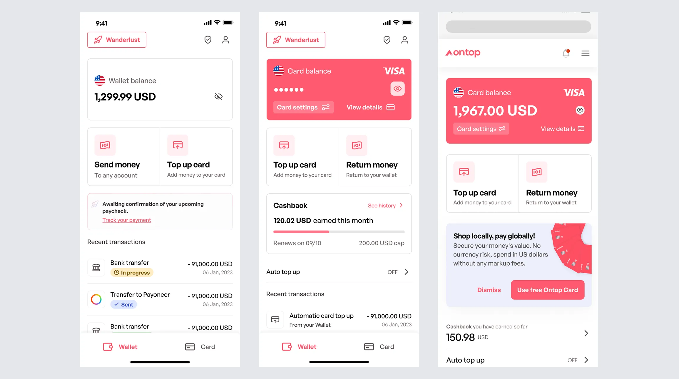
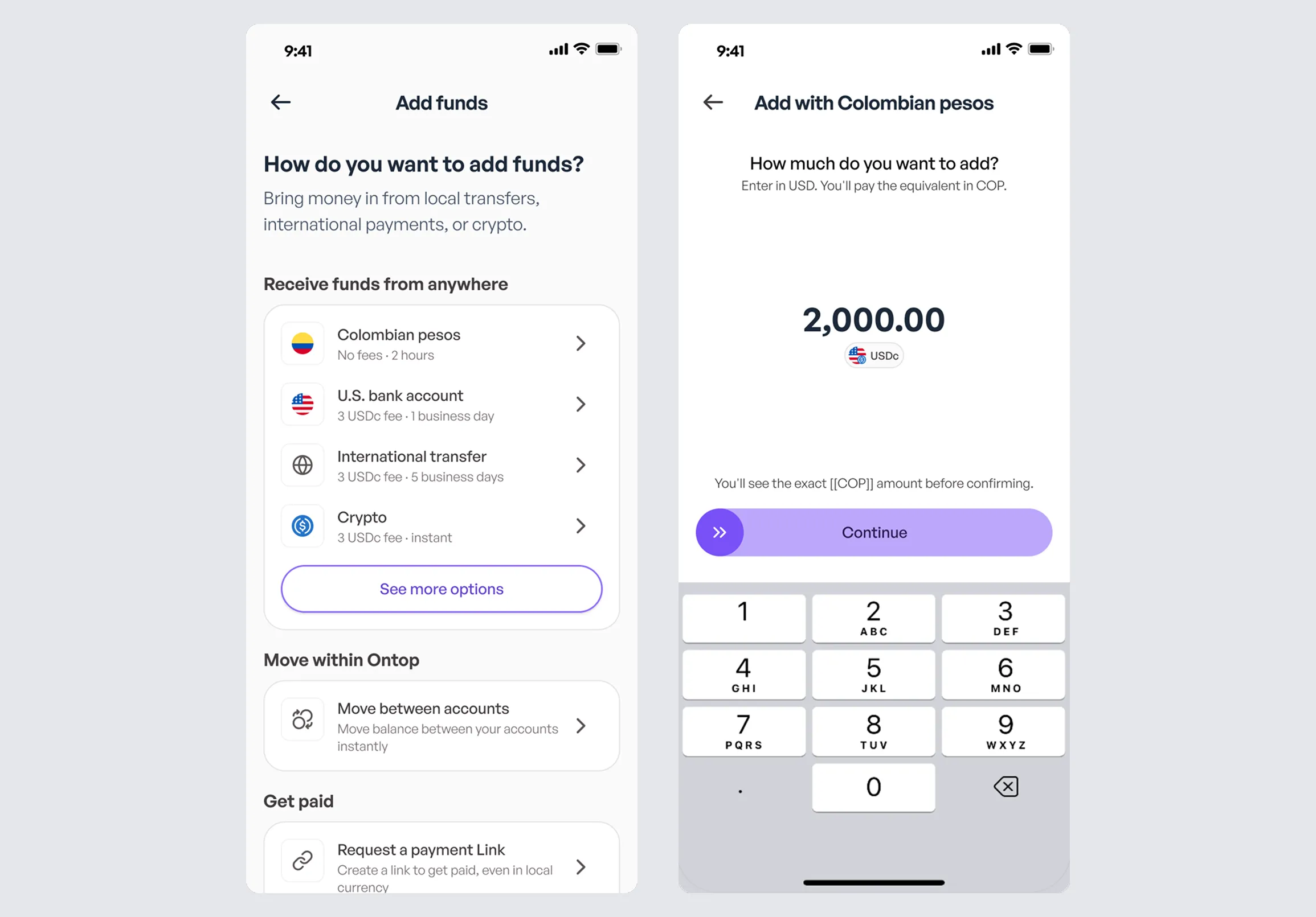
A simplified, action-oriented home screen
Shifted from a large menu to a dashboard with visible primary actions, a prominent balance, and quick access.
Reduced form friction
Used fewer fields, real-time validation, and microcopy that guides people through each step.
Purposeful microinteractions, not decoration
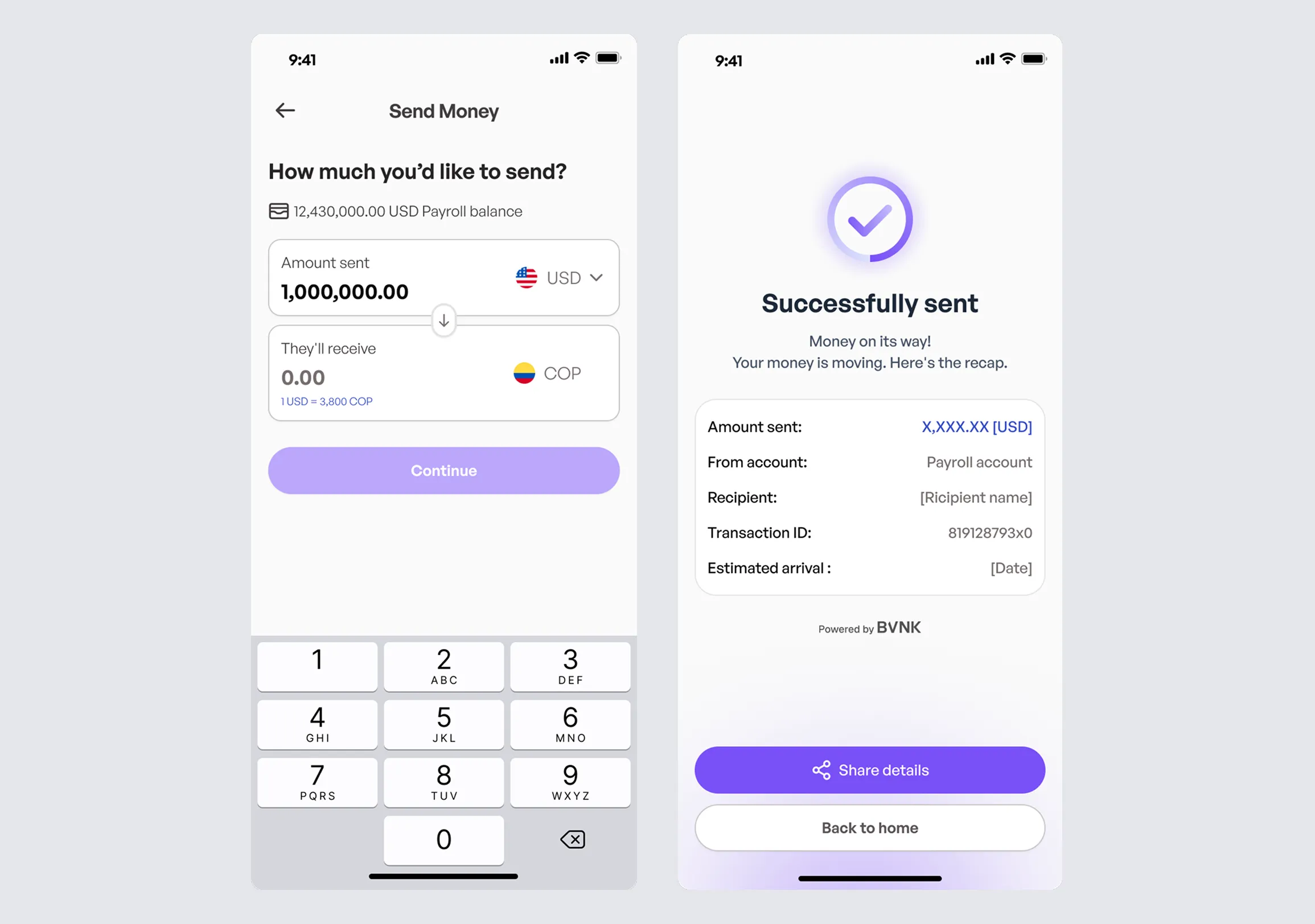
Every animation and visual response communicates status, progress, or confirmation.
Rapid testing with Engineering, UX, and Product
Ran weekly team iterations to validate decisions before committing development effort.
Solution
The result was an end-to-end redesign that modernized the experience and organized the product around clarity, trust, and speed:
A new visual system aligned with fintech standards (hierarchy, accessibility, consistency).
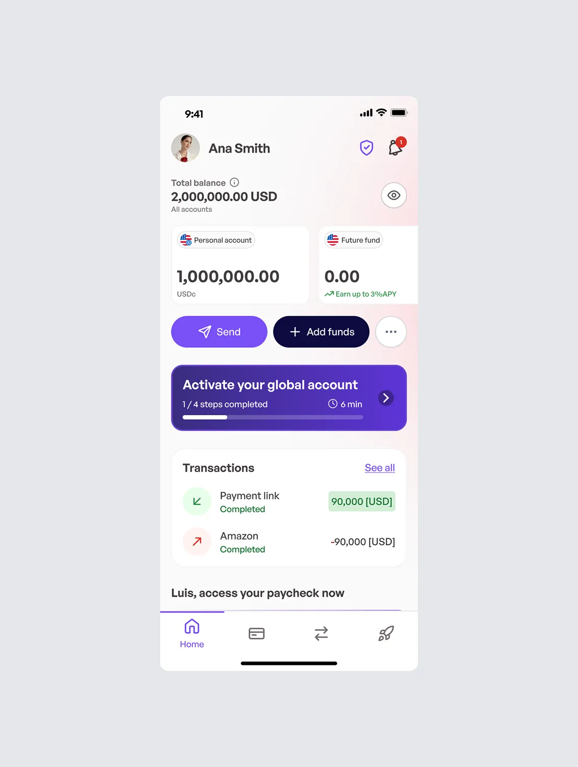
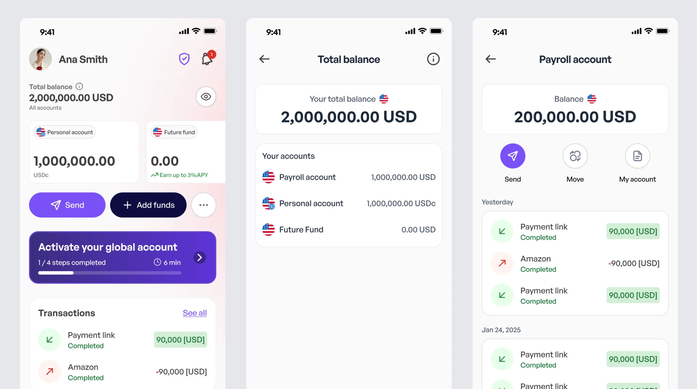
Clearer information architecture
Navigation and home were designed to help people find and do more in fewer steps.
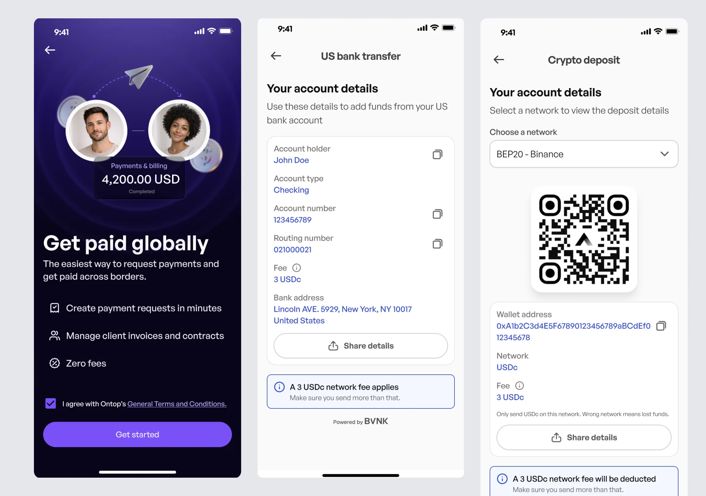
Optimized critical flows
Fewer redundant screens, clearer CTAs, and robust states and confirmations.
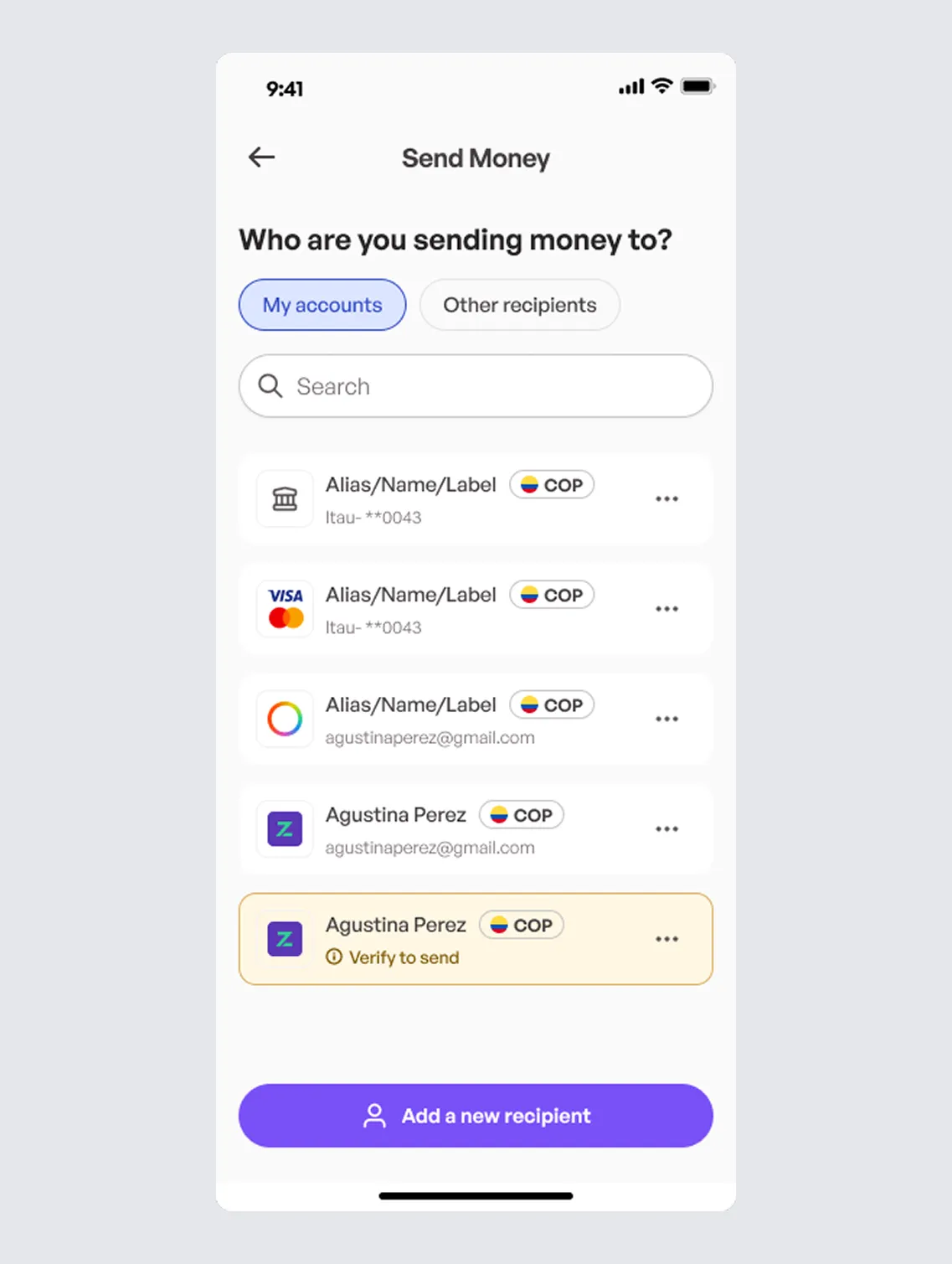
A foundation built for growth
The app is ready to support future incremental improvements, including new currencies and products, without reworking everything.
Impact
+32% MAU (18.8k → 24.8k)
Following the end-to-end redesign, the app significantly increased monthly active users.
+11% sessions per user (11.1 → 12.3)
People opened the app more often, signaling that the home screen and core flows became clearer and more actionable.
+9% session duration (~110s → ~120s)
Sessions became slightly longer, consistent with a smoother experience.
+60% monthly events (~2.1M → ~3.4M)
The total volume of in-app interactions increased.
10% to 18% conversion to first transaction
With fewer steps and better guidance in home CTAs and critical journeys, more users completed their first value-driving action.
Critical-flow drop-off from 20% to 12%
Fewer fields, clearer validation, and progress feedback reduced abandonment in the middle of transfer and withdrawal flows.
We redesigned Ontop Wallet end to end so moving your money would be simpler, more reliable, and faster. The numbers confirmed it.